Whale & Dolphin
Overview
The Whale and Dolphin Company is an organization providing eco-friendly wildlife cruises while helping to contribute to valuable marine research, explore remote destinations and encounter fascinating wildlife. Led by Dr. ‘Chas’ Anderson, the founding member of the Marine Research Centre (MRC), created the Whale and Dolphin company in 1998 to provide incredibly 10-12 day experiences and raise funds to contribute to the marine research and conservation efforts. Dr. Chas started an email list to raise awareness and grow his fan base of loyal subscribers. Each year, his loyal mailing list would get exclusive access to join them on liveaboard trips in the Maldives, Indonesia, Seychelles, Solomon Islands, and Sri Lanka.
Chas is expanding operations by adding a website to gather more online visibility and increasing the frequency they can take liveaboard trips each year.
The Challenge
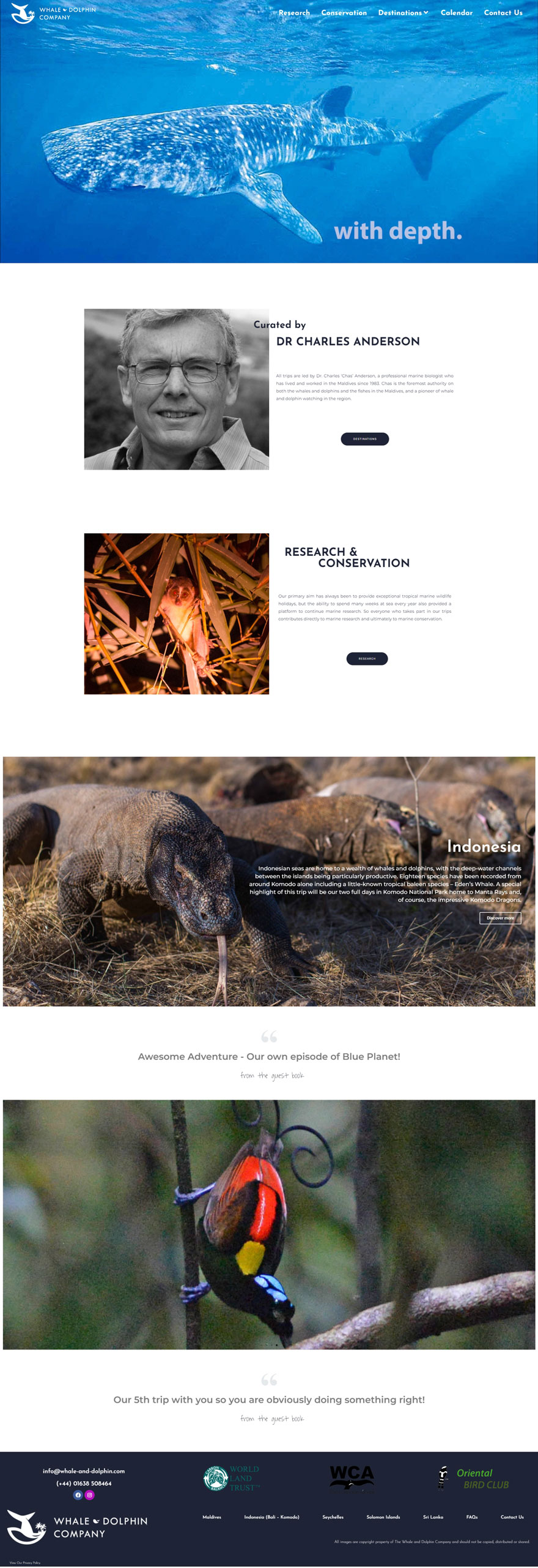
The Whale and Dolphin Company had recently hired a website team to design their new online presence and it didn’t go as planned. The website was signed off with fundamental UI (user interface) errors, a basic homepage that was confusing to visitors, and missing spacing, fonts, colors, and CTA’s on the inner pages.
Suffice to say that this experience left a bad impression on them.
When they approached MK Way, they wanted to meet in-person with our team. We discussed our approach to Heuristic Audits, and how we tackle technical challenges with website images. We showcased how we approach website design with the use of a professional project management tool to track three core areas in our workflow
Area 1: Our Website Assessment
Area 2: Our Website Implementation Standards
Area 3: Quality Assurance & Feedback loops
Once we signed off, we found the following areas to improve from our initial assessment.
- Visitors were clueless on the homepage, due to a lack of brand messaging and proper information architecture
- The homepage did not have a clear value proposition
- Visitors aren’t guided to take any action due to lack of CTA buttons
- The website’s copy lacked clarity and did not effectively communicate with the target audience, leading to confusion and low conversion rates.
- High-res images flooded the site, causing slow loading times
- Huge accessibility issues due to copy added on images
- Contact page form is poorly placed & designed
- Newsletter subscription pop-ups that was confusing to close
- Missing links on the footer to their social media
- Broken or missing links in buttons
- Websites’ Innerpages had cosmetic issues on both desktop and mobile version
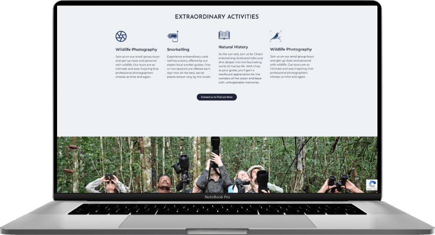
- Responsiveness issues with sections and buttons not visible on mobile
- No clear CTA to the newsletter to attract a bigger fanbase
The Solution
Our solution involved a two-fold approach to address the website’s challenges.
1. Re-design the homepage:
We created a new homepage that addressed the challenges of the previous design. We started by adjusting the copy to make it more sales-oriented and appeal to the target audience.
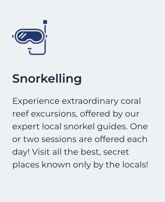
Old Copy
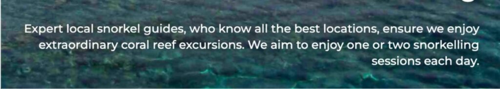
New Copy
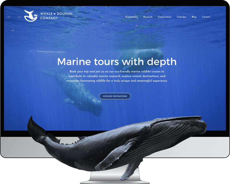
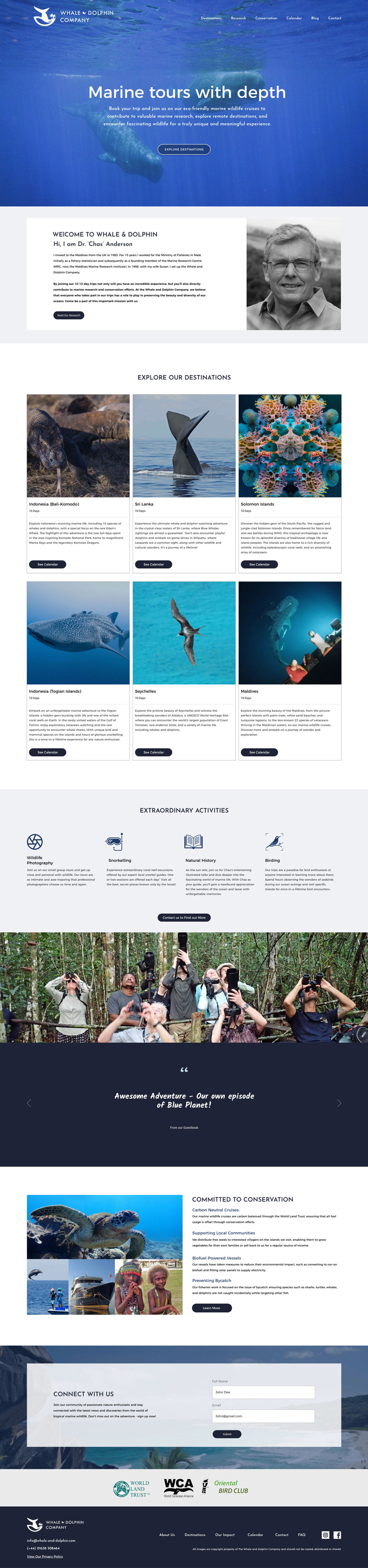
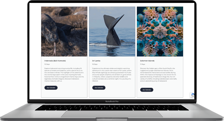
We then designed a new navigation and menu that was relevant to visitors and helped them find what they were looking for. We also implemented an above-the-fold strategy with messaging that clearly communicated the company’s offerings and included a prominent call-to-action (CTA) that led to the destinations page. We strategically placed essential information about the company and services on the homepage in a user-centered order, including properly placed CTA buttons to guide visitors towards the actions we wanted them to take. The result was a useful, delightful, and conversion-oriented experience for visitors.
Old Homepage
New Homepage
2. Technical and cosmetic improvements to the inner pages:
As a next step, we identified and addressed all technical and cosmetic issues throughout the website, resulting in a fast, responsive, and well-designed online presence. This included optimizing images, improving accessibility, fixing broken links, enhancing the design of inner pages, and ensuring the website displayed properly on all devices. With these improvements, we were able to create a seamless user experience for visitors, leading to increased engagement and conversions.
The Result
With these improvements, we were able to create A seamless user experience for
visitors, leading to increased engagements and conversions.
INDUSTRY
Wildlife tourism
LOCATION
Somberg, Canada
INVOLVEMENT
UI/UX Audit
Homepage Redesign
UI optimization
VISIT
Whale & Dolphin