Physio Pros
Overview
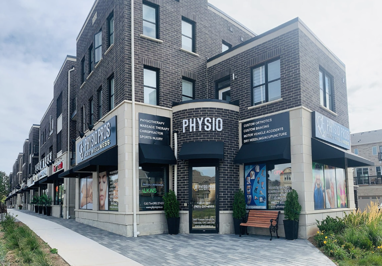
Physio Pros is a physical therapy clinic located in Oakville, Ontario, Canada. The head physiotherapist and owner, Paul, reached out to our agency for help with his clinic’s identity design. At the time of the initial consultation, the clinic was not yet open for business, and Paul shared his vision for the space with us.
Vision
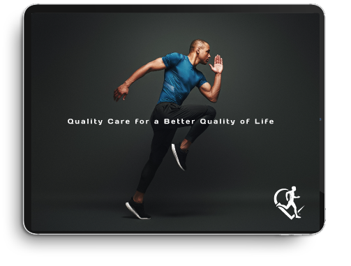
Warm, welcoming atmosphere where patients are cared for and treated in the best possible way.
The Challenge
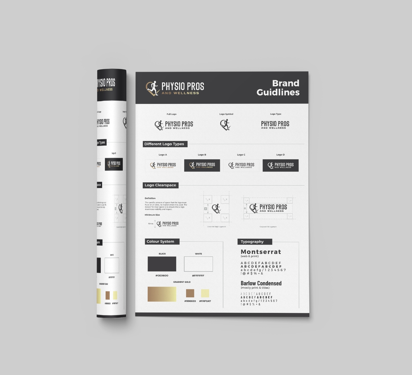
One of the challenges we faced in this initial project was finding a way to make the logo for Physio Pros stand out in an industry where many symbols associated with wellness and physical therapy are overused. We wanted to create a logo that reflected the brand’s values and goals, while also one that would be distinctive and easily recognizable.
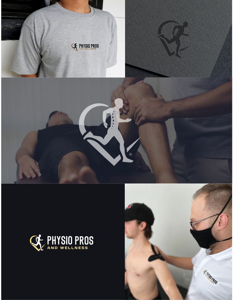
The Logo
To overcome this challenge, we drew inspiration from the clinic’s vision of providing a warm and caring environment for patients. We decided to combine the shape of a heart, symbolizing care and compassion, with the silhouette of a person running, representing the journey towards improved health and wellness.

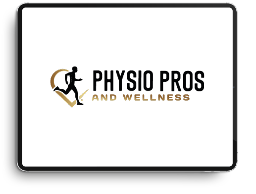
This symbol perfectly captured the essence of Physio Pros and set the brand apart from its competitors. In terms of color palette, Paul expressed a preference for gold, black, and brown tones. We carefully selected these colors to create a rich and warm aesthetic that evokes feelings of comfort and well-being, fitting the brand’s vision of providing a welcoming and caring atmosphere. We also took inspiration from Paul’s plans to use brick as a primary material in the clinic’s construction, choosing a tall bold, condensed font that complemented the traditional aesthetic of the brick and the overall look and feel of the clinic.
The Logo
This symbol perfectly captured the essence of Physio Pros and set the brand apart from its competitors. In terms of color palette, Paul expressed a preference for gold, black, and brown tones. We carefully selected these colors to create a rich and warm aesthetic that evokes feelings of comfort and well-being, fitting the brand’s vision of providing a welcoming and caring atmosphere. We also took inspiration from Paul’s plans to use brick as a primary material in the clinic’s construction, choosing a tall bold, condensed font that complemented the traditional aesthetic of the brick and the overall look and feel of the clinic.
The Deliverables
Our logo package, which is provided to all our clients, included various file formats such as JPEG, PNG, and EPS, to ensure that the logo can be used seamlessly across all platforms and mediums. In addition, we also provided a detailed brand manual that outlines the guidelines for the proper use and implementation of the logo, color palette, typography and other visual elements, allowing Physio Pros to maintain a consistent and cohesive image across all their materials.