Tools Used


The client approached us to create a platform to sell cannabis and psilocybin mushroom products. They pride themselves on high-quality, locally sourced, lab grown ingredients.
We were tasked with creating a brand around the concept of “inner” and “outer” space. Inner products are mushroom based and have the effect of hyper-focus. They provoke inward, deep thinking and focus.
Outer products are cannabis-based and would create the opposite effect. They provoke feelings of relaxation and tranquillity and promote a fun, lightweight feeling.
Our mission was to create an e-boutique brand that would take the website visitor on an extraordinary learning experience before they made their first purchase online.
Client — Innerspace
Location — Canada
Industry — Psilocybin Products
PRODUCT PHOTOGRAPHY
CONTENT STRATEGY
COPYWRITTING
WEBSITE (UI/UX) DESIGN
WEB DEVELOPMENT
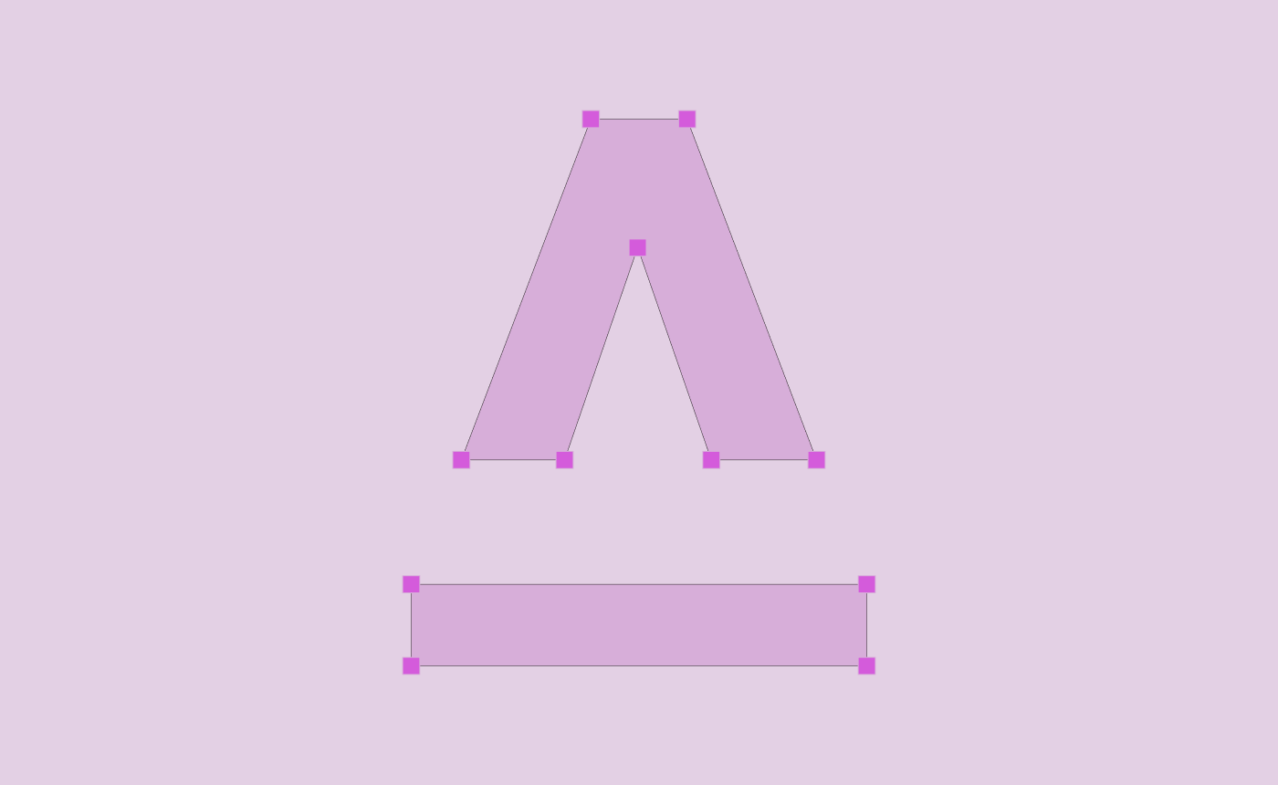
How does one create a platform representing two dimensions of the human experience while building a user-experience-friendly e-commerce website? This was the profound question that guided our creative journey.
Having only a logo and a raw concept of inner and outer at hand, our design team embarked on the extraordinary challenge of transforming these initial sparks into a fully-fledged universe of colour, interactivity, and seamless functionality.
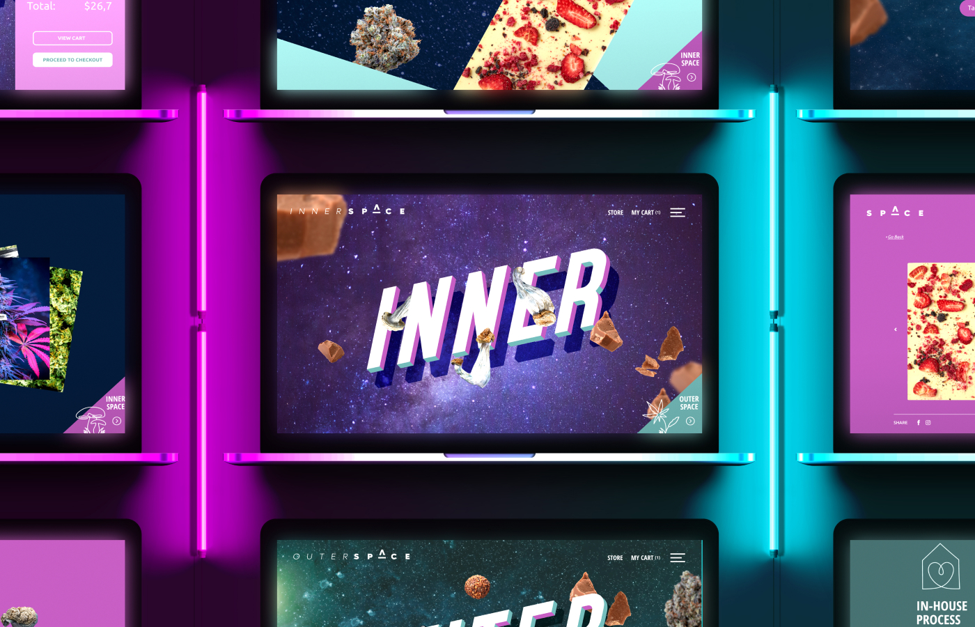
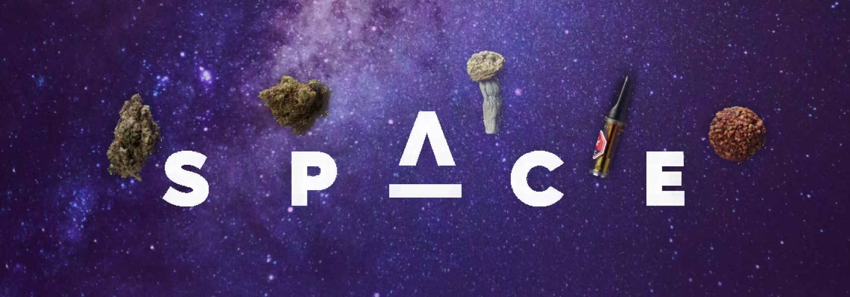
We collaborated with a local photographer to create captivating images and stop-motion animations, which were used to showcase the products as rotating planets, adding a sense of dynamism to the experience.
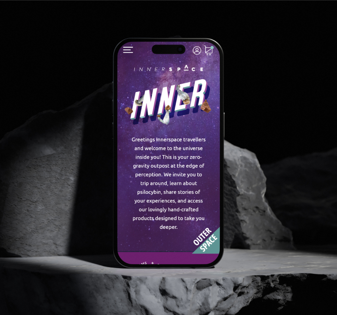
We developed a distinct colour palette, using deep green/teal tones for the outer experience and purple/pink tones for the inner experience. This visually represented the different dimensions and created a cohesive and engaging visual identity. We also employed a combination of clear, readable fonts along with stylish and modern typefaces to strike a balance between readability and visual appeal.
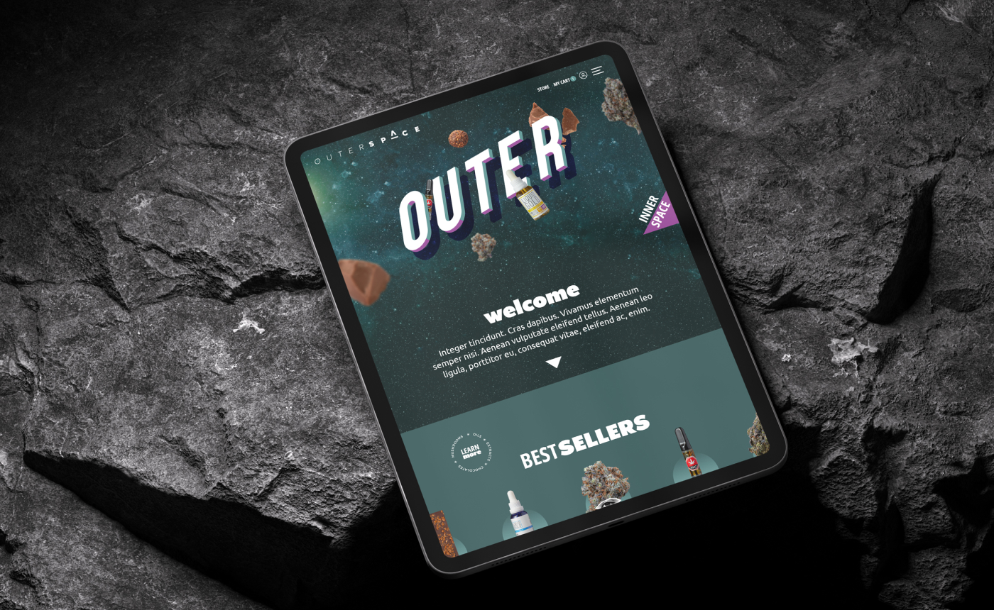
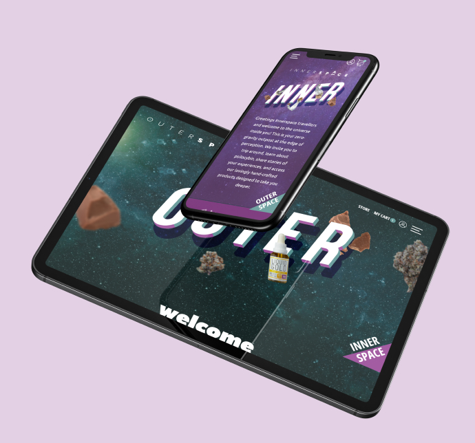
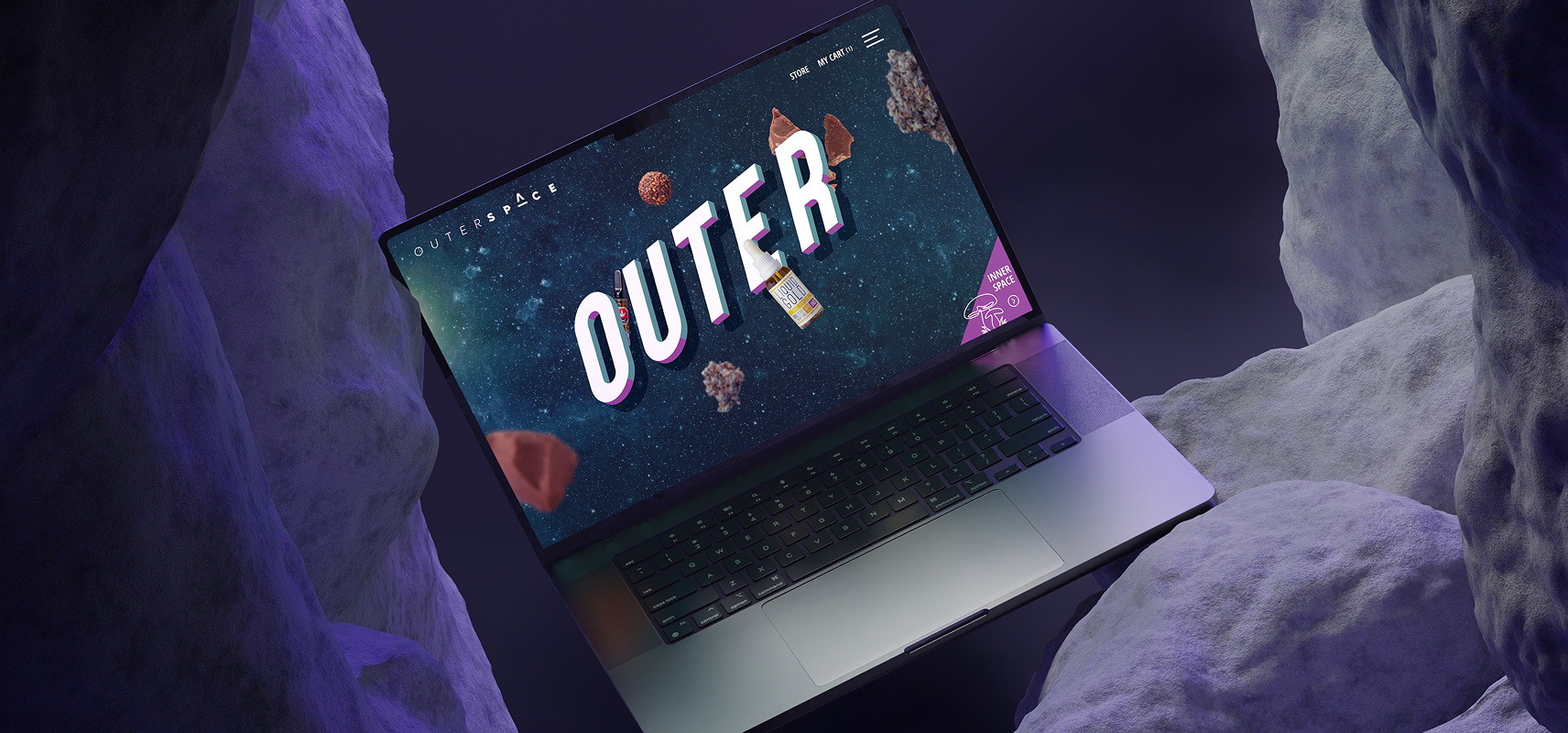
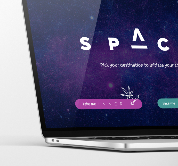
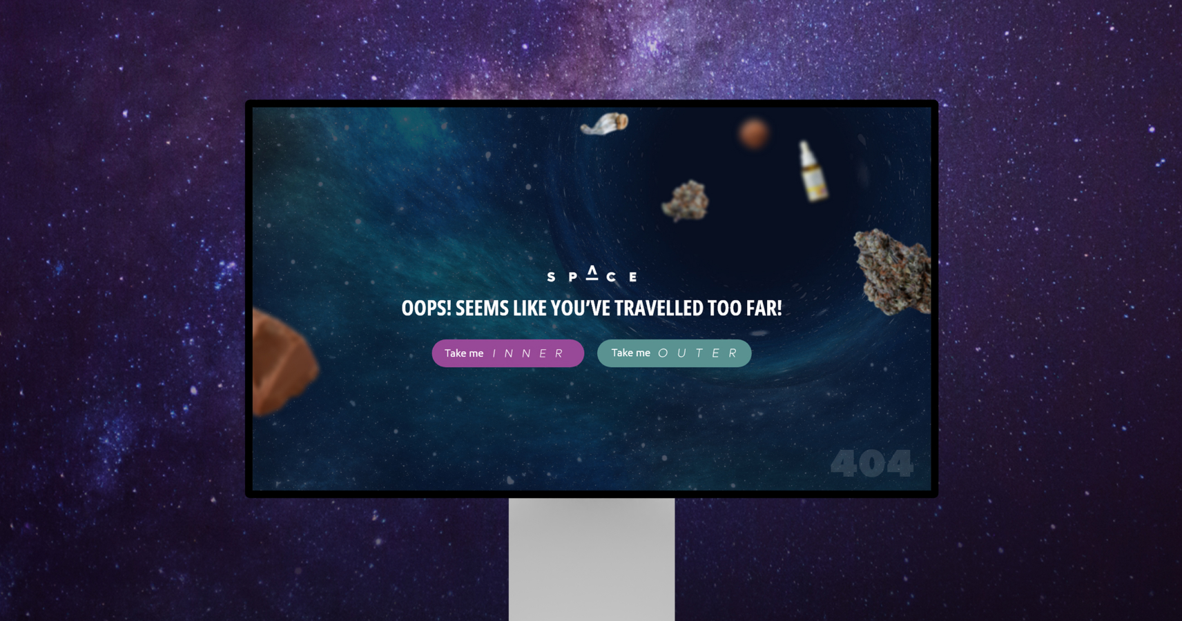
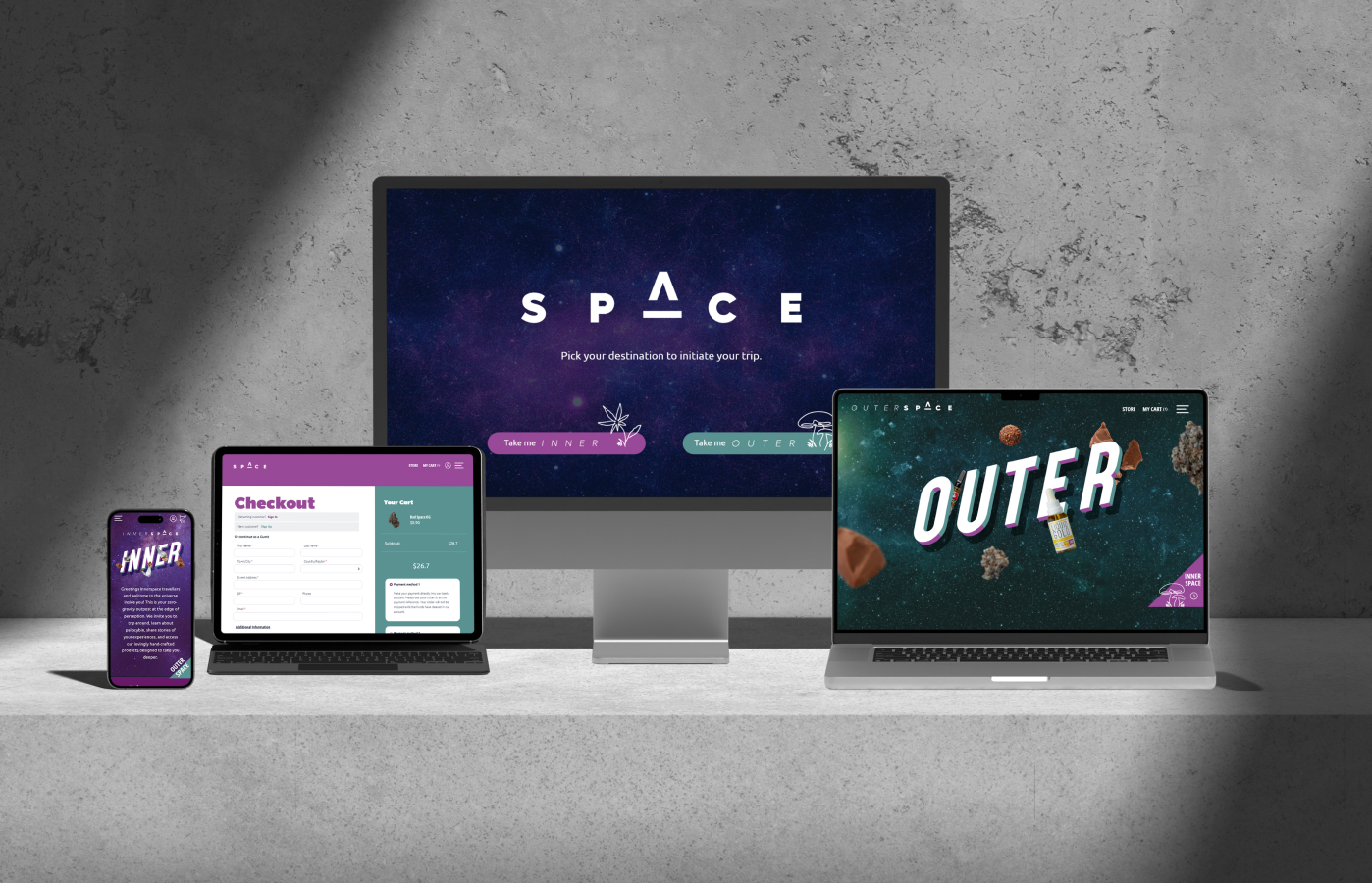
We developed a splash page that allowed visitors of legal age to choose between the inner and outer navigational experiences of the website. Additionally, we implemented a “sticky” button that followed the visitor, providing easy and seamless navigation between the two dimensions at any point.
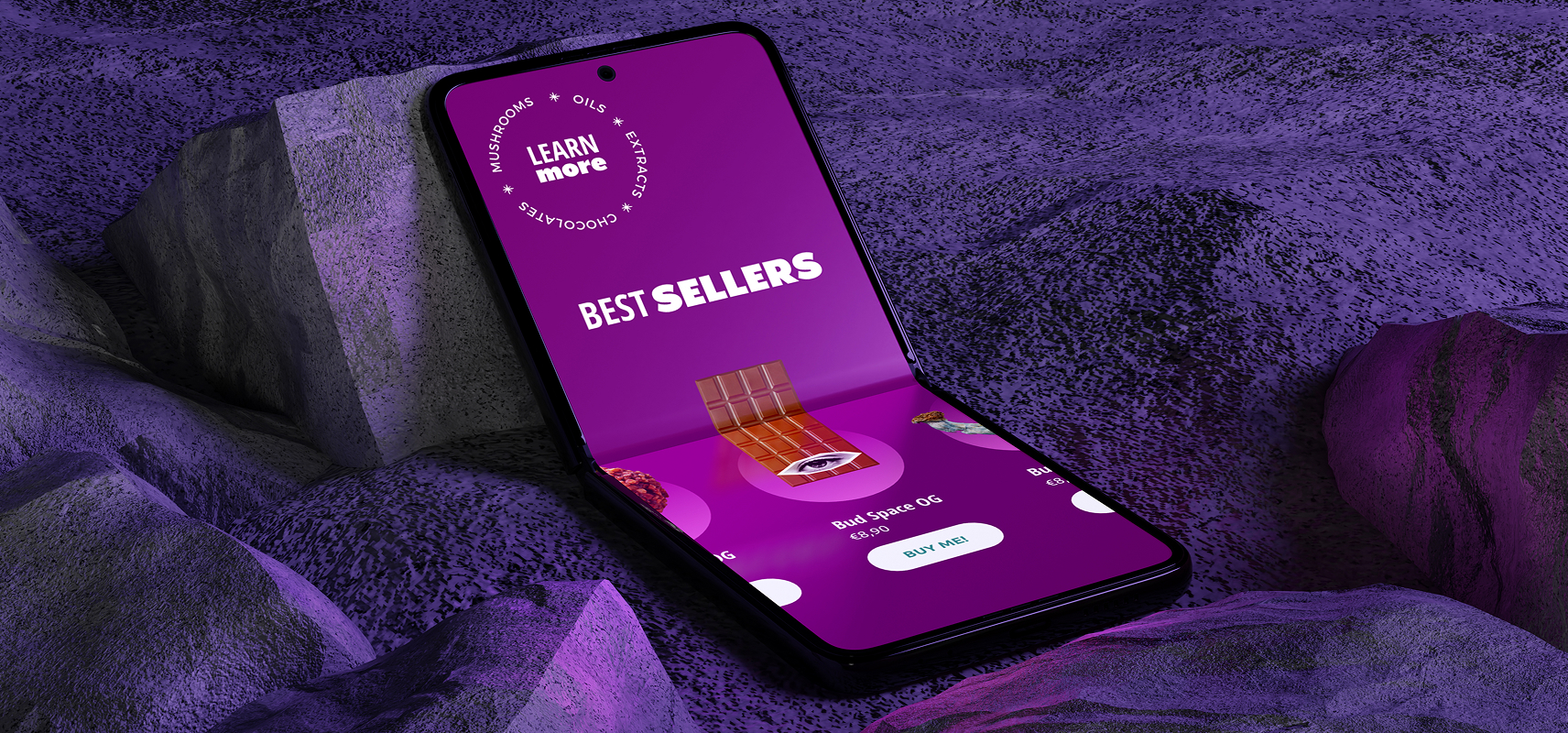
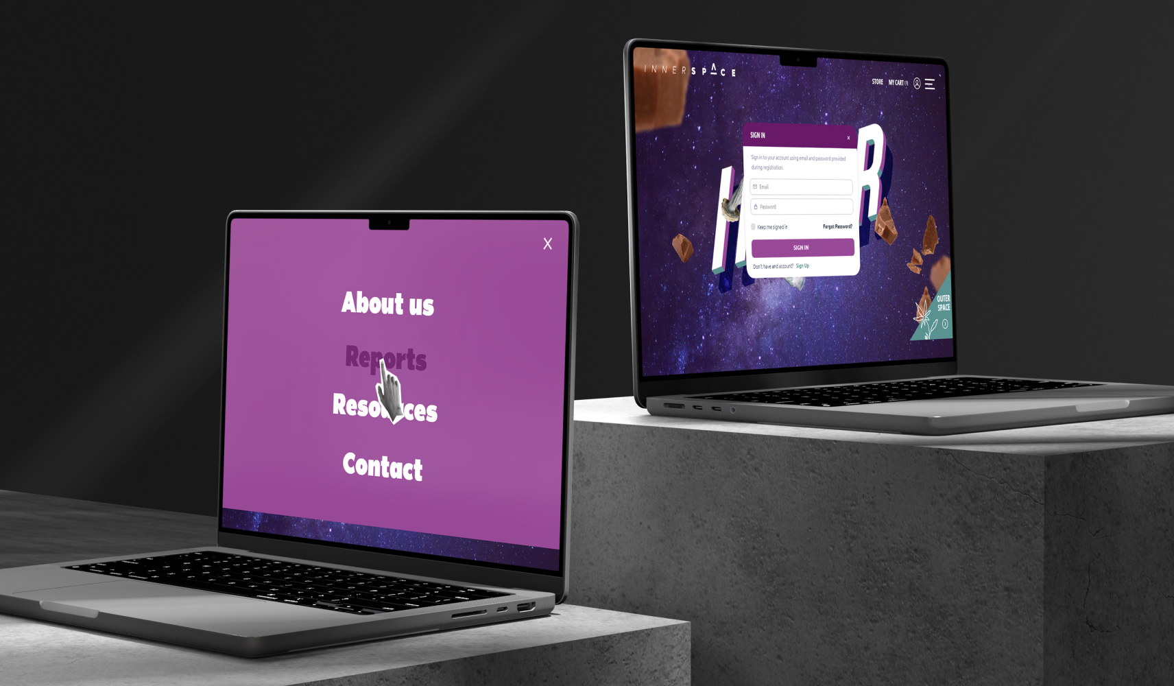
We implemented interactive animations that followed the mouse movement, combined with floating elements throughout the website. This created a multi-levelled visual experience, allowing visitors to feel a sense of flow and active participation in the trippy journey.
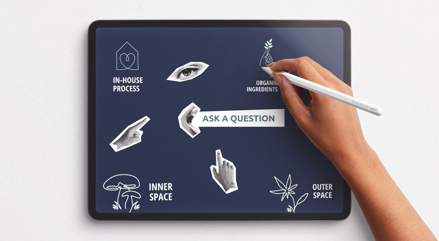
We created custom icons and implemented trippy mouse hover effects to elevate the overall experience. By incorporating collage-style black and white images of body parts associated with the human senses for the hover effects, we enhanced the website’s trippy look and feel, adding an extra layer of visual intrigue.
We implemented a user-centric design philosophy, utilizing the new brand identity and AI-generated imagery to create a responsive, modern, and user-friendly website. The design reflected the new brand ethos, ensuring a seamless and engaging user experience.
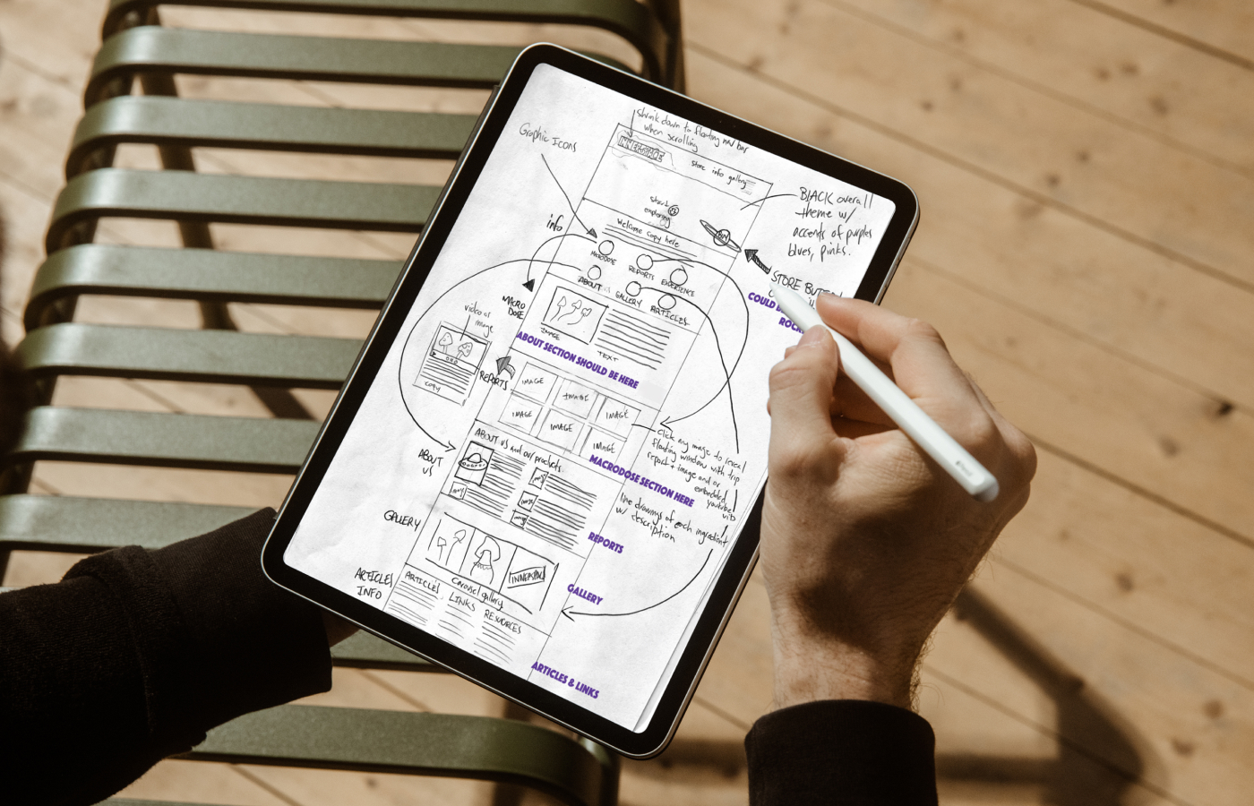
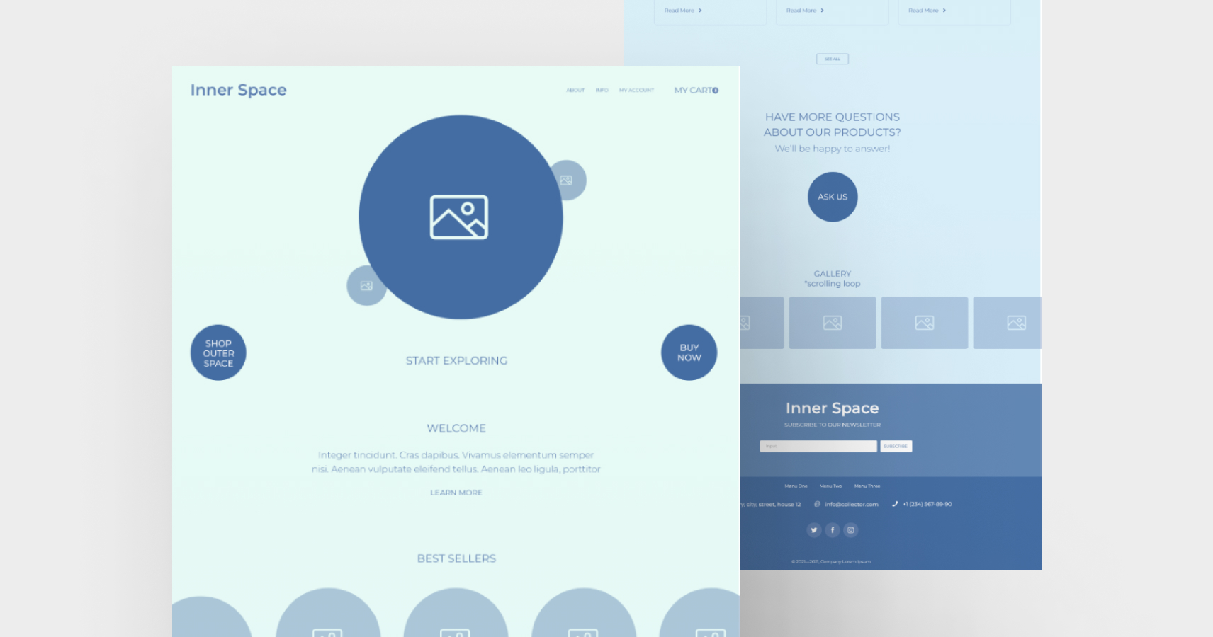
We implemented a user-centric design philosophy, utilizing the new brand identity and AI-generated imagery to create a responsive, modern, and user-friendly website. The design reflected the new brand ethos, ensuring a seamless and engaging user experience.
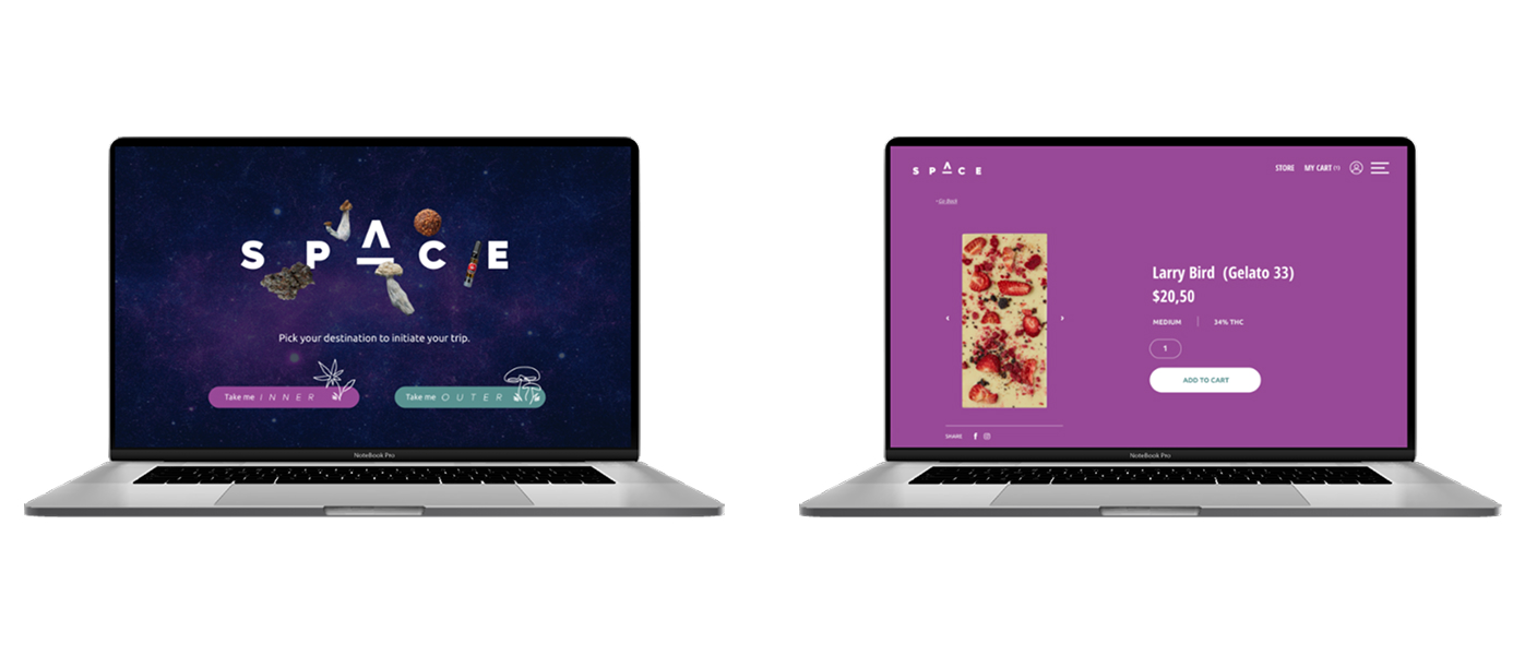
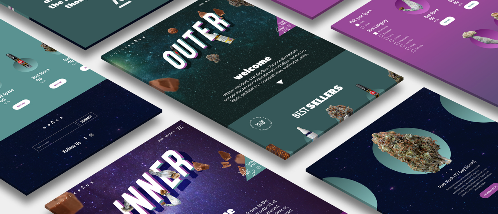
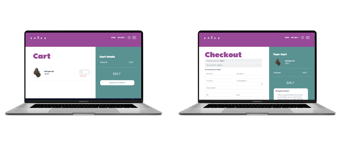
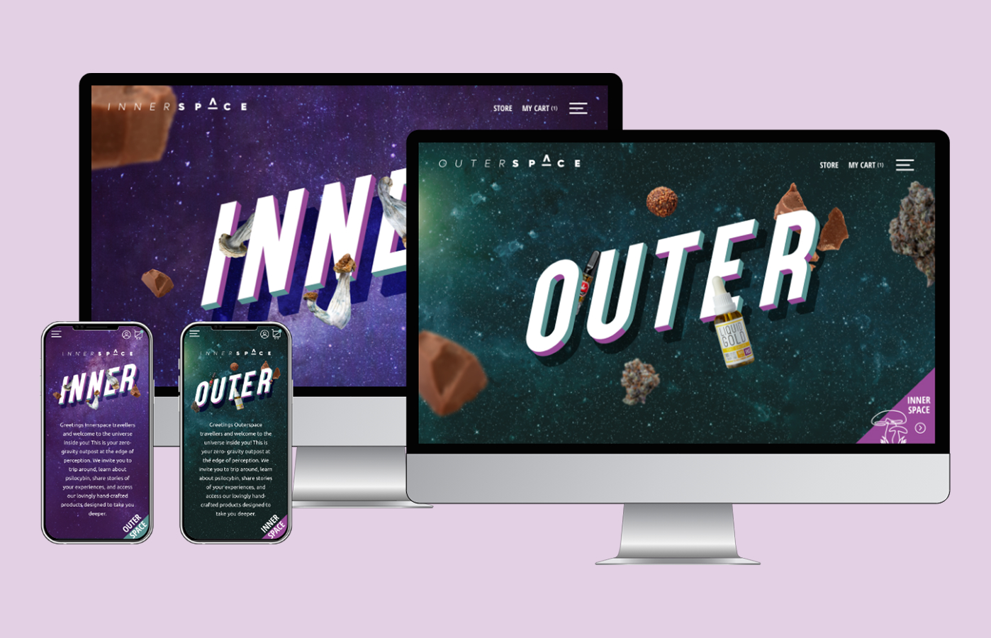
We designed a streamlined custom checkout process, incorporating best practices for e-commerce. We ensured that visitors were well-informed throughout the process and minimized the number of steps required to reach their goal.
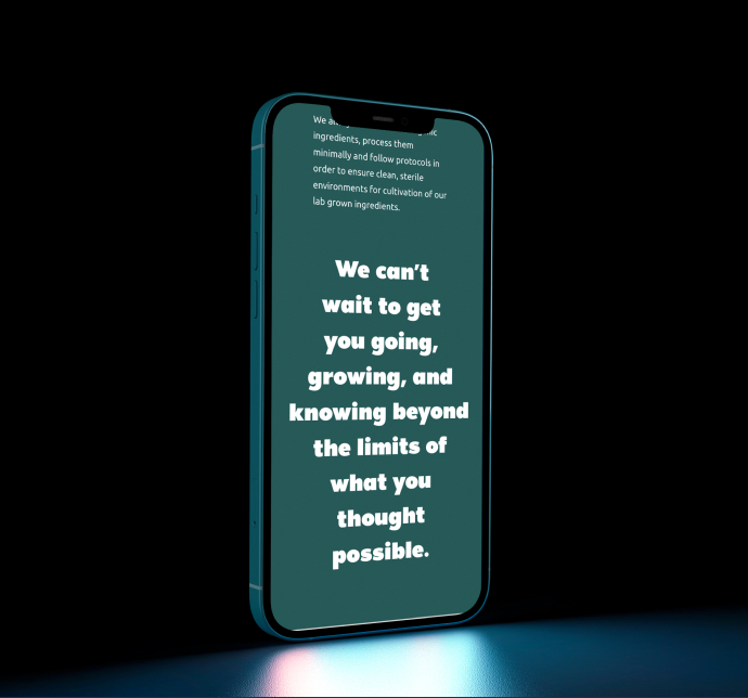
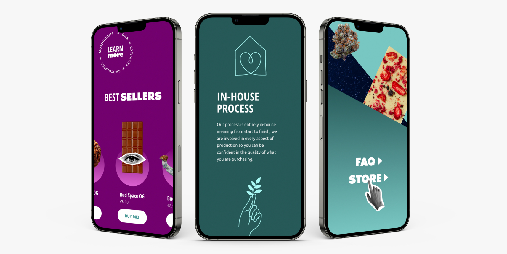
We implemented adaptive design, optimizing the website for mobile devices. This strategic decision allowed for an exceptional mobile-friendly experience, ensuring that users could fully engage with the inner and outer spaces on any device, anywhere they go.
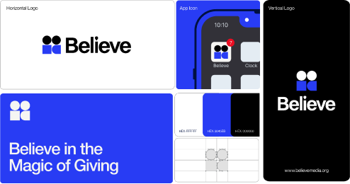
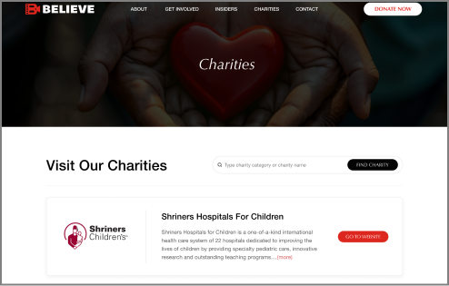
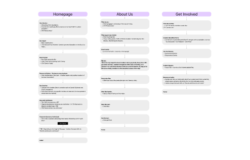
We believe in value. Value that makes the difference in your results, without the uncomfortable conversation to upsell an extra item with a price tag. MK-Way regularly goes above and beyond because we genuinely care about the people we work with. Here are a few value-added items that we prepared for Believe as our way of showing our appreciation for their business.
