
Mission Protocol
Arsenal Human Creative Brilliance, Supercharged by AI.
Trusted by 1,000s of growing business owners
Engineered for the 3.5-second attention span. We eliminate friction and guide users seamlessly to the conversion point, ensuring your traffic leads to actual revenue.
Fortune 500 strategy. Boutique craft. We build robust identity systems that establish immense credibility from the first glance.
Turning boring docs into Netflix-style learning. We transform your standard operating procedures into highly engaging video content.
Broadcast quality. Social media speed. We produce breathtaking cinematic video campaigns in a fraction of the time and cost of a traditional film crew.
OUR WORK
Our MK-Way pilots command the frontier of AI and automation. We merge elite human strategy with hyper-efficient computational pipelines to engineer stunning, precision-crafted design experiences at 10x the speed of traditional agencies—delivering massive production yields without sacrificing a single pixel of soul.
View our cool projectsWe reinvest 20% of every invoice back into your business. For every dollar you spend with us, you natively earn Growth Credits sequentially to fund bonus promotional videos, strategy audits, or extra tier social assets. It's essentially an internal R&D budget on us.
Calculate My Credits
Creativity heals. We donate exactly 3% of every single project directly to fund art therapy programs for trauma survivors and historically neurodiverse youth. When you grow your brand sequentially with us, you fundamentally empower inclusive creative expression where it's desperately needed most.
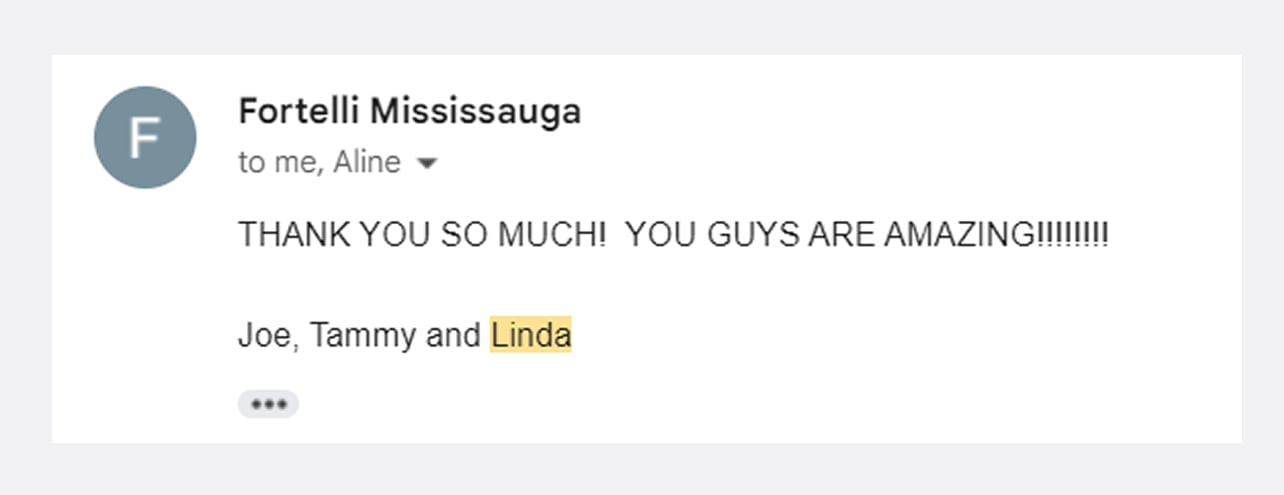
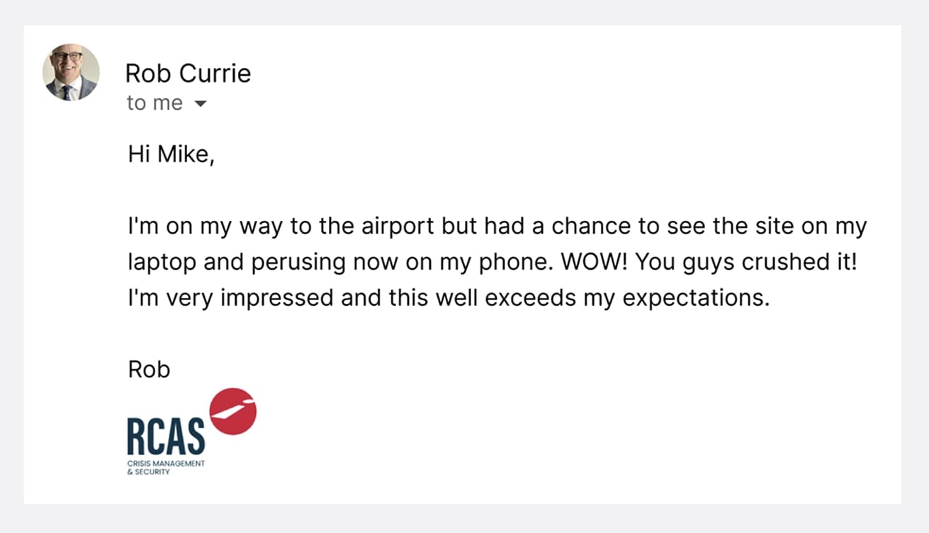
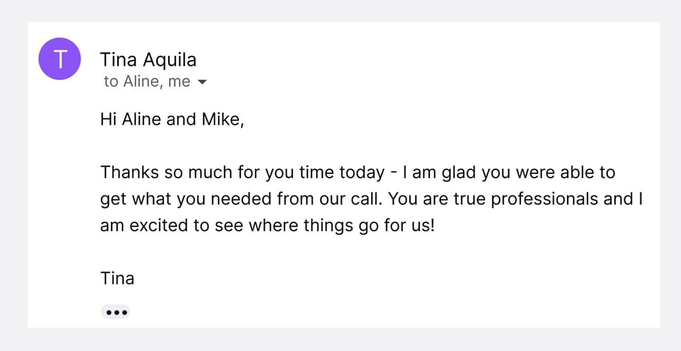
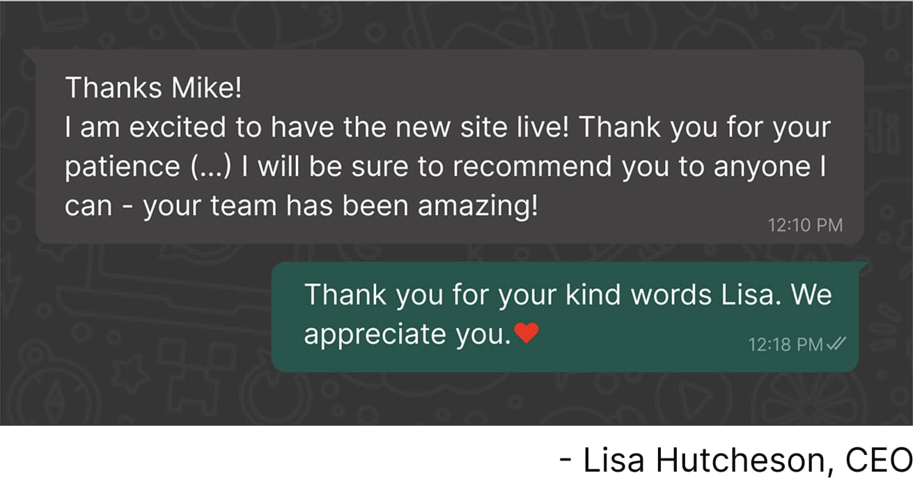
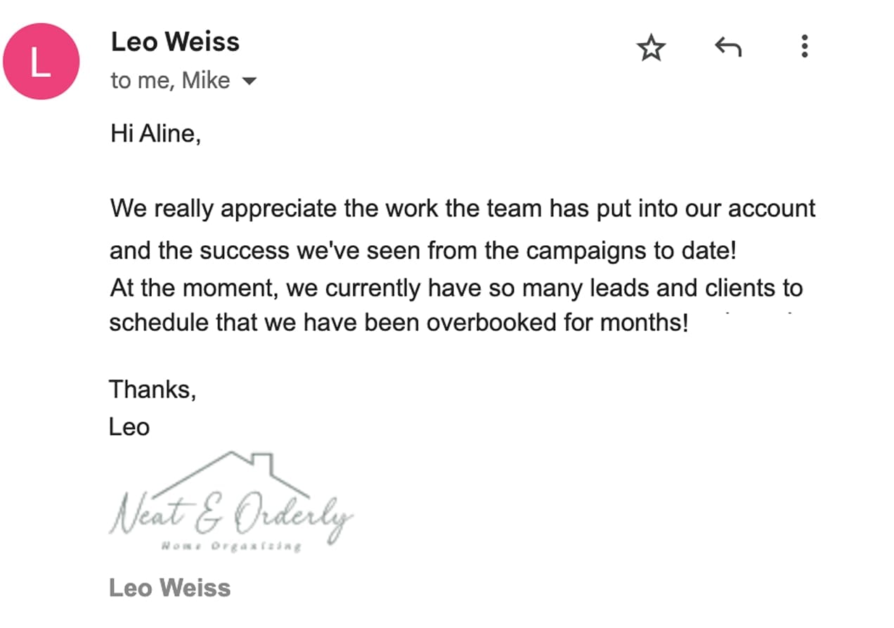
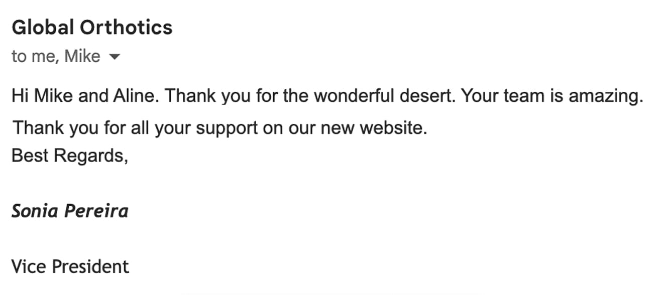
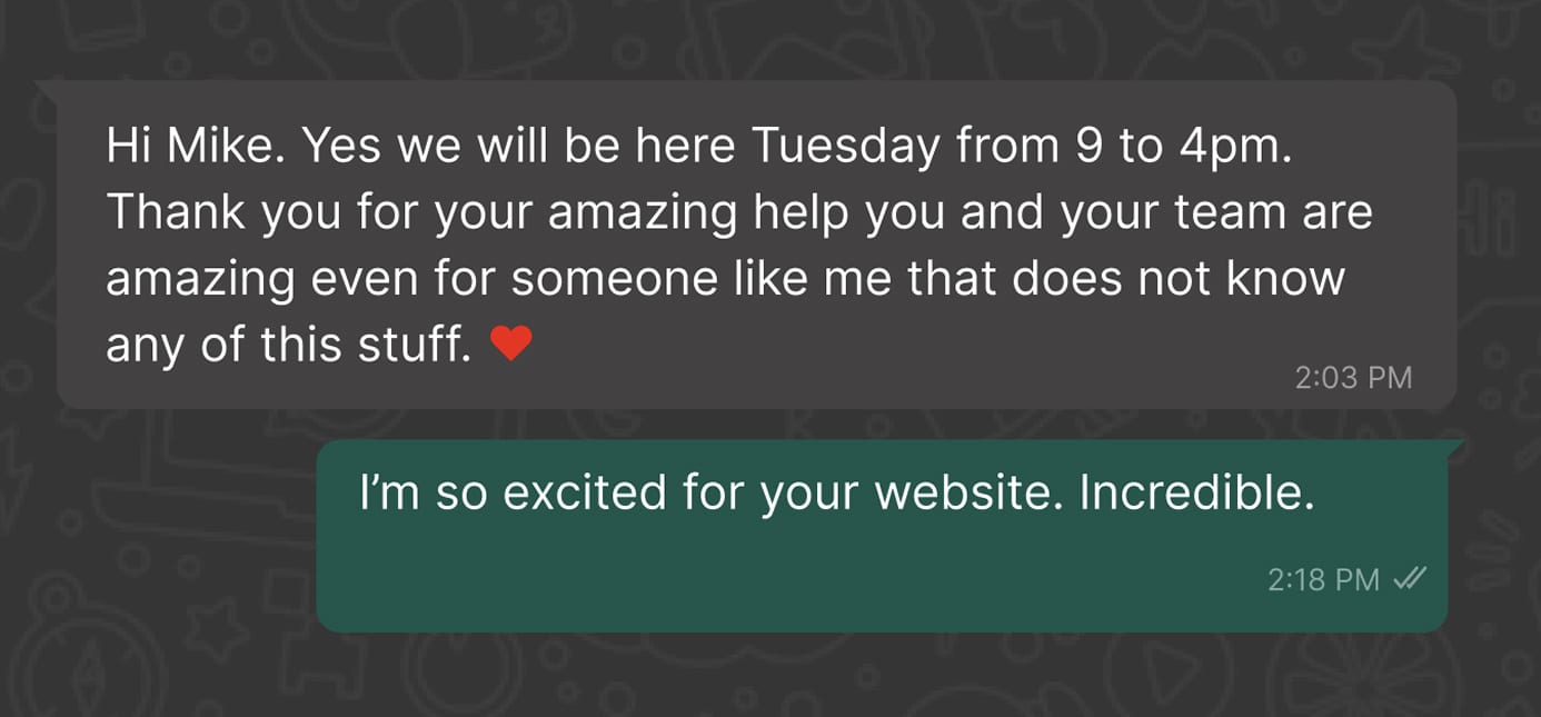
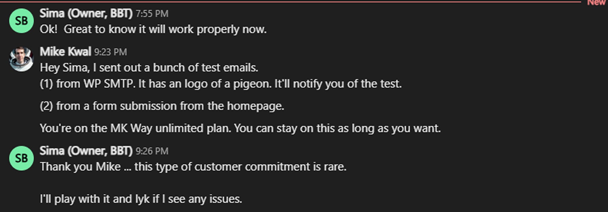
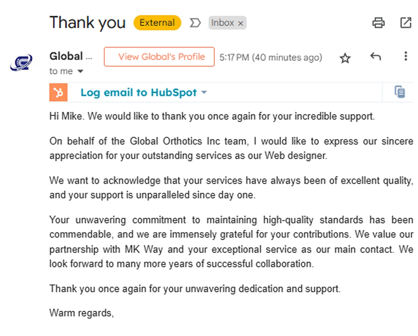
Raw, unfiltered transmissions from our partners on the front lines.
Incoming Message
ENCRYPTED_CHANNEL

Incoming Message
ENCRYPTED_CHANNEL

Incoming Message
ENCRYPTED_CHANNEL
Incoming Message
ENCRYPTED_CHANNEL

Incoming Message
ENCRYPTED_CHANNEL
Incoming Message
ENCRYPTED_CHANNEL
Incoming Message
ENCRYPTED_CHANNEL
Incoming Message
ENCRYPTED_CHANNEL
Incoming Message
ENCRYPTED_CHANNEL
Incoming Message
ENCRYPTED_CHANNEL
Incoming Message
ENCRYPTED_CHANNEL
Incoming Message
ENCRYPTED_CHANNEL
Incoming Message
ENCRYPTED_CHANNEL
Incoming Message
ENCRYPTED_CHANNEL
Incoming Message
ENCRYPTED_CHANNEL
Incoming Message
ENCRYPTED_CHANNEL
Incoming Message
ENCRYPTED_CHANNEL
Incoming Message
ENCRYPTED_CHANNEL
Incoming Message
ENCRYPTED_CHANNEL
Incoming Message
ENCRYPTED_CHANNEL
Incoming Message
ENCRYPTED_CHANNEL
Incoming Message
ENCRYPTED_CHANNEL
Incoming Message
ENCRYPTED_CHANNEL
Incoming Message
ENCRYPTED_CHANNEL
Questions & Answers