Tools Used


Zisla, a pioneering real estate company specializing in Mexican properties, engaged our services for an extensive UI/UX redesign. Our mission was to transform their complex, information-dense website into an intuitive, user-friendly platform, enhancing navigation and information accessibility.
Client — Zisla
Location — Canada
Industry — Real Estate
WEBSITE (UI/UX) DESIGN
CONTENT STRATEGY
COPYWRITTING
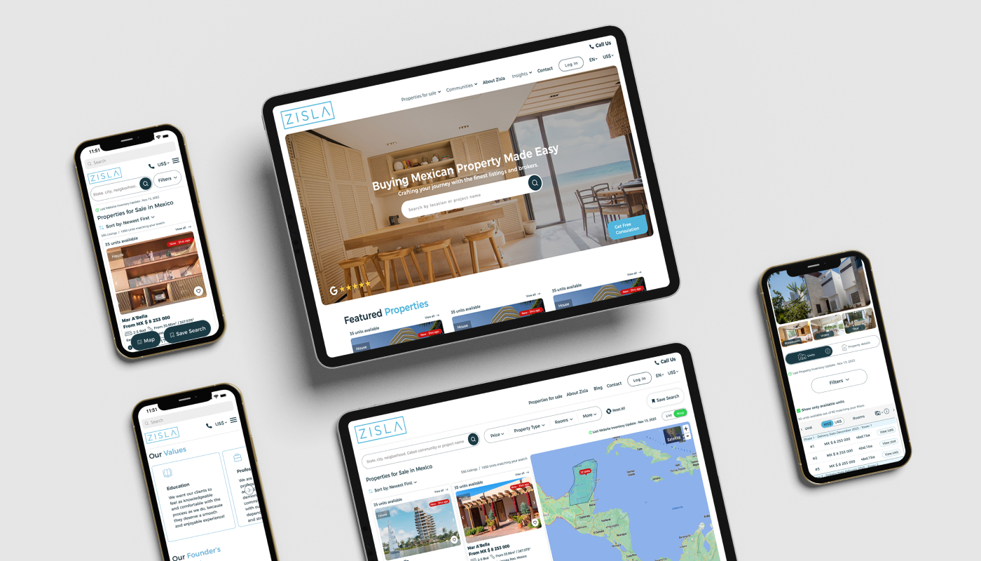
Zisla’s distinct business model of selling multiple units within larger properties required a tailored design approach to effectively market and present individual units. Serving an international clientele posed the challenge of dynamically displaying accurate prices in multiple currencies while managing fluctuating exchange rates and ensuring transparency. Additionally, the need to present extensive information for numerous units necessitated a complete overhaul of the information architecture, creating a user-friendly navigation system that balanced accessibility and clarity without overwhelming users.
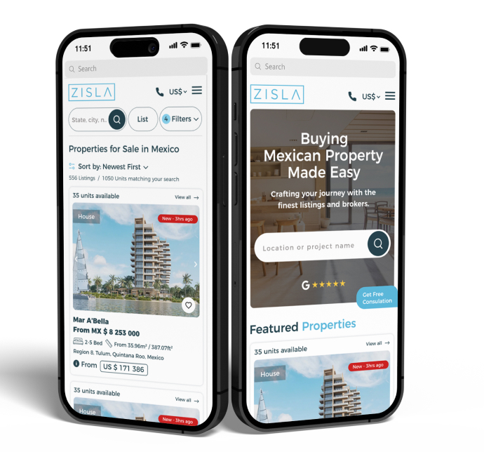
Our redesign of Zisla’s homepage began with a meticulous focus on the above-the-fold area, understanding its critical role in user engagement and conversion. We introduced a visually captivating and intuitive layout, ensuring that key elements such as the prominent search bar and the ‘free consultation’ button were immediately accessible. This strategic placement was designed to capture user attention and encourage immediate interaction.

Recognizing the diverse needs of Zisla’s audience, we embarked on a comprehensive overhaul of the website’s information architecture. Our goal was to simplify the user journey, making it more intuitive and aligned with user expectations. We meticulously organized content and navigation elements to ensure that users could effortlessly find what they were looking for, whether it was property listings, investment advice, or insights about living in Mexico.
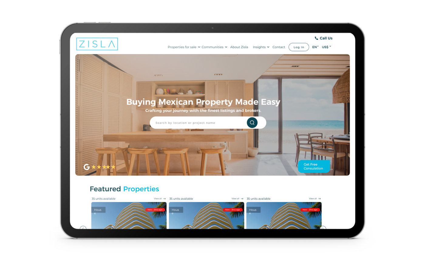
Every aspect of the homepage was crafted with Zisla’s target audience in mind. We conducted extensive research to understand the preferences and behaviour’s of potential property buyers and investors. This insight allowed us to create a user experience that was not only aesthetically pleasing but also highly functional and relevant to the users’ needs.
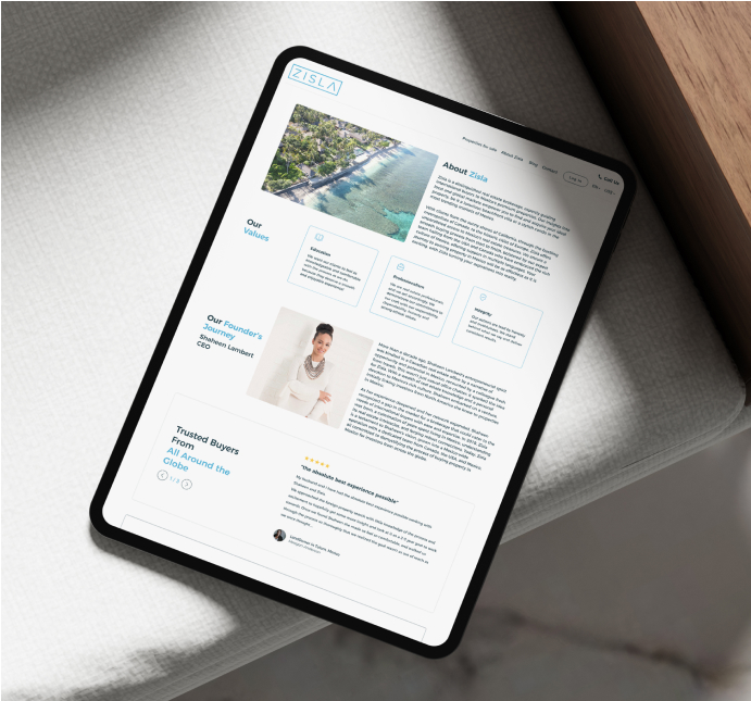
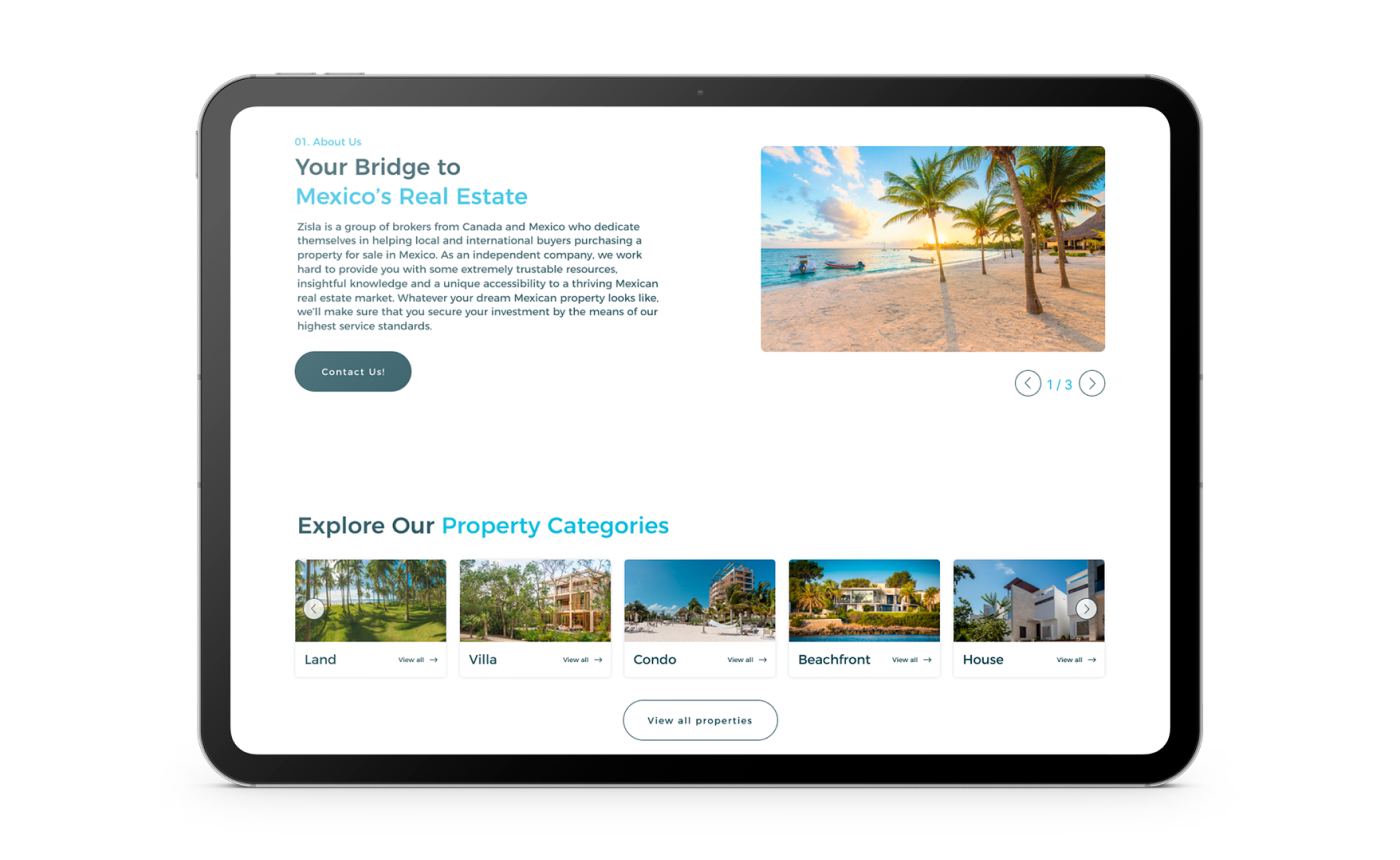
We strategically developed a 3-fold ‘About Us’, each part designed to showcase a significant aspect of the Zisla experience. This approach was aimed at providing a comprehensive and engaging narrative that would motivate and resonate with visitors.
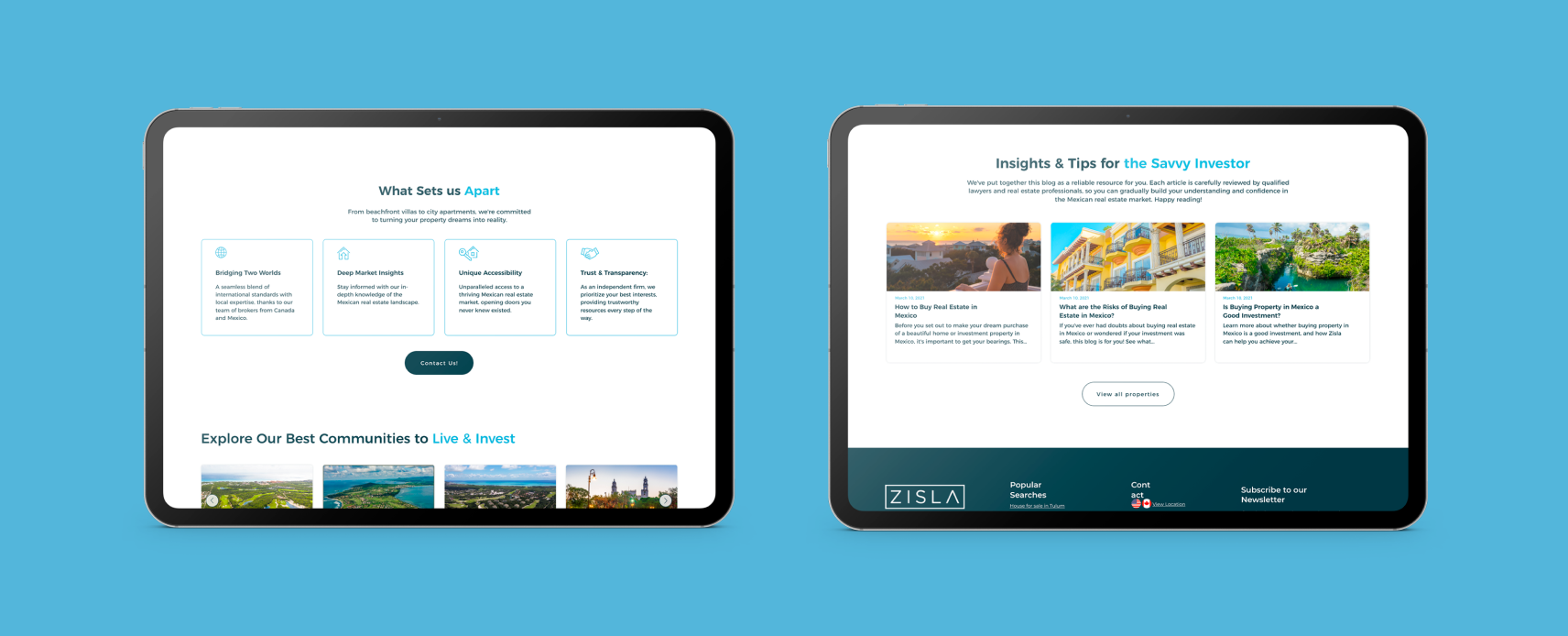
Our comprehensive analysis of competitors informed the development of four unique selling points that clearly articulated Zisla’s distinct advantages in the market.
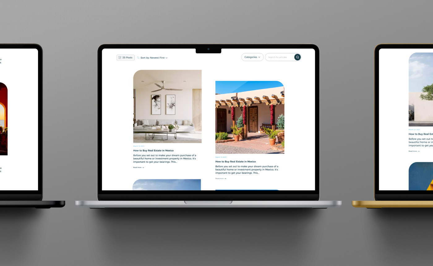
The original ‘Our Blog’ section of Zisla’s website, while informative, lacked engagement and value perception. We rebranded it to ‘Insights & Tips for the Savvy Investor,’ immediately communicating the content’s relevance to potential investors and property buyers. This positioned the blog as a strategic tool for informed decision-making in real estate investment, rather than just a source of information.
We added a compelling description: “We’ve put together this blog as a reliable resource for you. Each article is carefully reviewed by qualified lawyers and real estate professionals, so you can gradually build your understanding and confidence in the Mexican real estate market. Happy reading!” This reinforced its role as a key resource for insightful, expert-backed content, empowering readers in their real estate investment decisions.
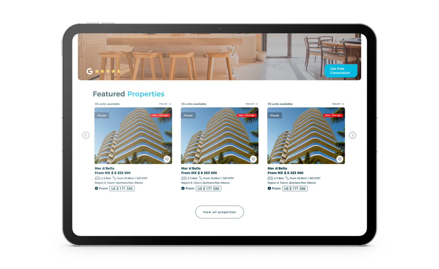
Emphasis on Unit Availability: A significant aspect of our card redesign was the clear display of the number of available units for each property. This was a crucial element, considering Zisla’s unique business model focusing on unit sales. We integrated this information seamlessly into the design, ensuring it was prominently displayed without overwhelming the other details.
Clear Call-to-Action for Unit Viewing: Understanding the importance of user journey continuity, we incorporated a distinct and compelling call-to-action (CTA) on each property card. This CTA was strategically placed to encourage users to explore further, leading them directly to detailed unit listings and enhancing the potential for conversion.
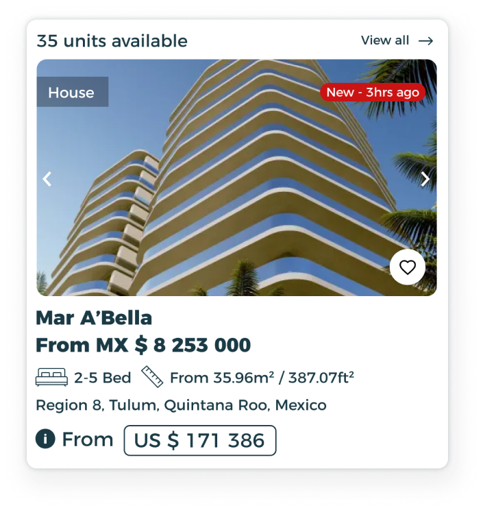
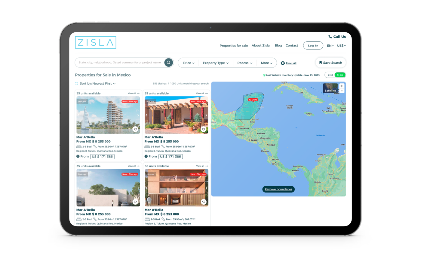
Addressing the previous challenge where the map functioned merely as a complementary element to the list view, we redesigned the property cards for map integration. This involved creating a simpler version of the property card specifically for the map view, ensuring that it provided essential information while maintaining clarity and ease of use.
This redesign transformed the map from a secondary feature into a fully functional and integral part of the property search experience, catering to users who prefer a more visual approach to property discovery.
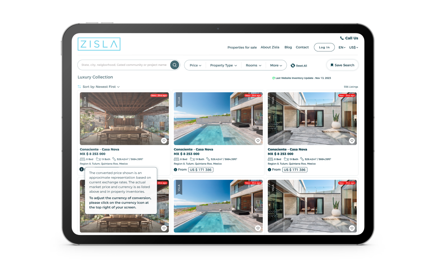
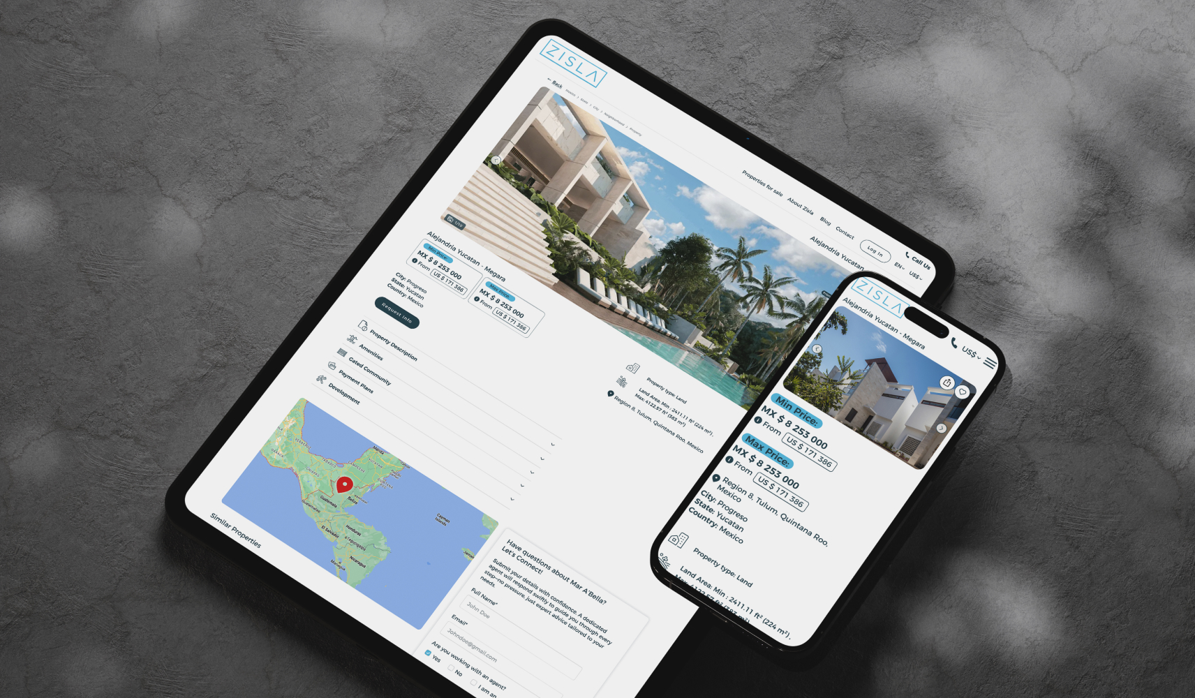
In our redesign, we introduced an innovative dual pricing system to enhance the user experience for Zisla’s diverse international clientele. Prices were displayed in Mexican Pesos (MX $) as the primary currency, with a secondary currency automatically determined based on the user’s geolocation. This dynamic approach ensured that users saw pricing in a familiar currency, making the property listings more relatable and understandable.
To address potential confusion arising from currency conversion and fluctuating exchange rates, we implemented an interactive disclaimer popup. This feature was designed to educate users about the pricing mechanism, providing transparency and building trust. The popup explained how prices were converted and updated, ensuring users had a clear understanding of the pricing structure.
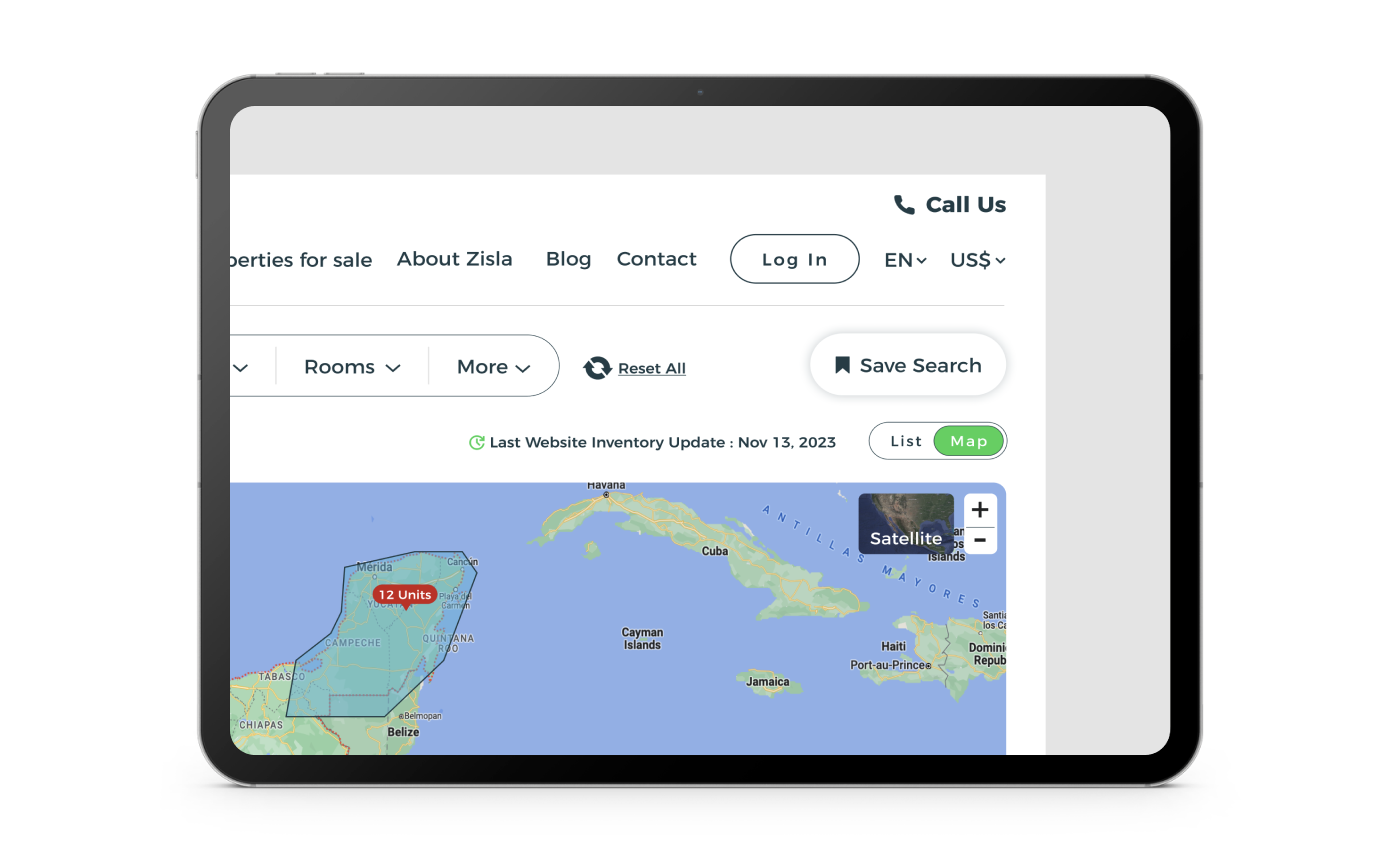
To address potential issues with geolocation inaccuracies and specific browser security settings, we implemented a currency selection dropdown in the website’s main menu. This feature allows users to manually select their preferred currency, offering greater control over their browsing experience. This fail-safe mechanism is particularly important for users traveling or using VPN services, allowing them to customize their experience and view prices in their chosen currency, thereby enhancing user satisfaction and accuracy in pricing display.
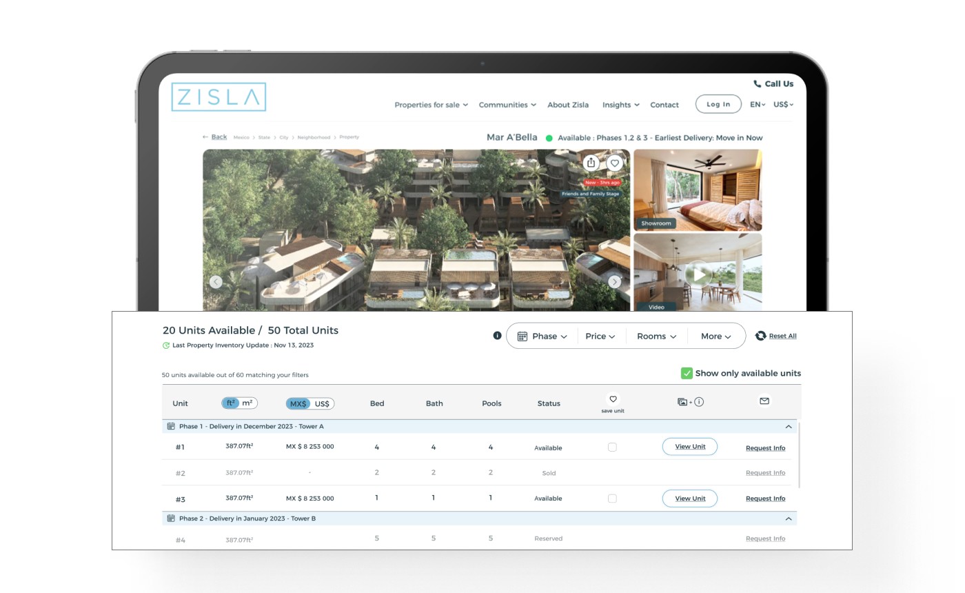
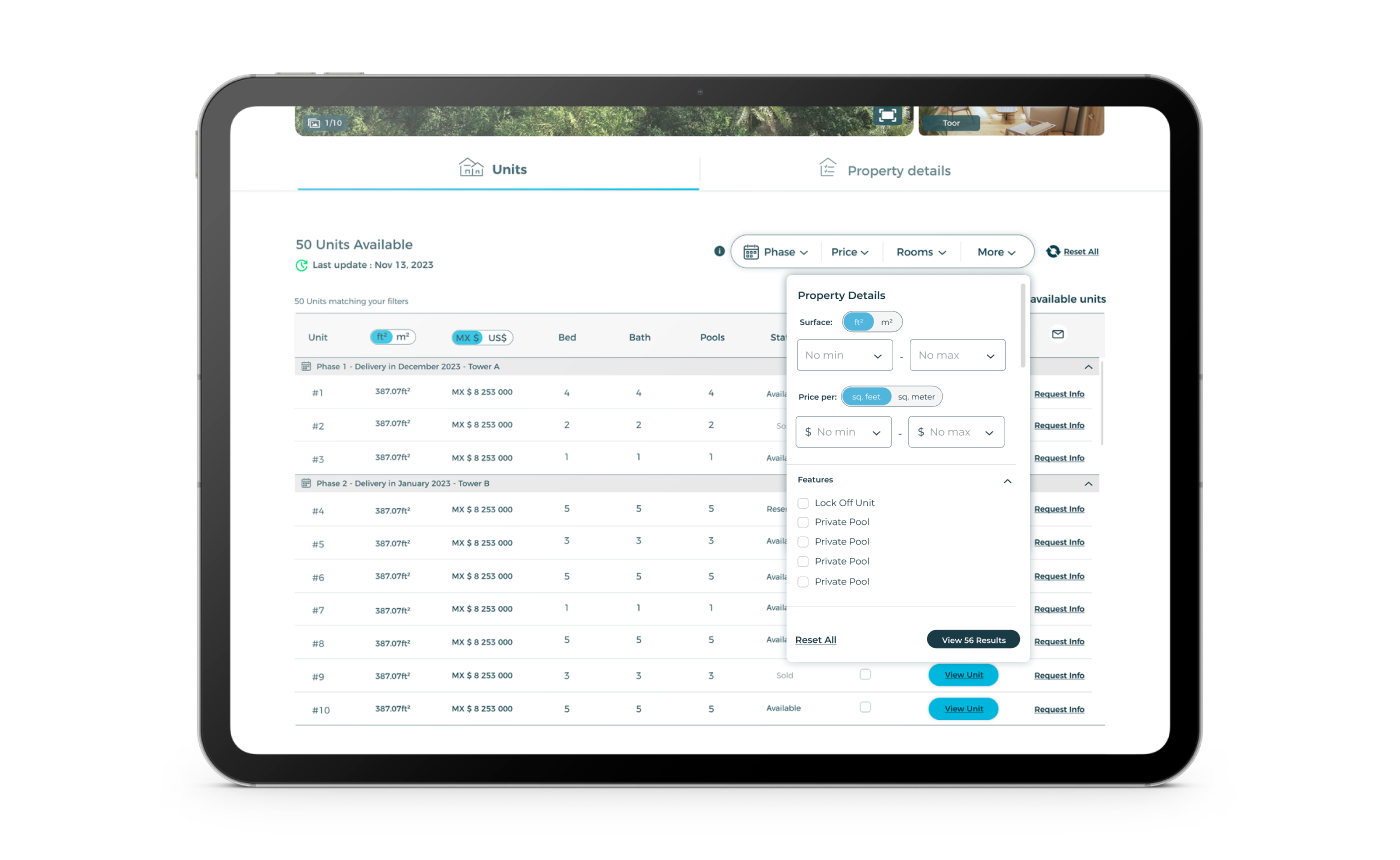
We revolutionized the property pages by introducing a dual-view feature. This allowed users to seamlessly toggle between comprehensive property details and a listing of available units. This design enhanced user experience by providing a holistic view of each property and its individual units.
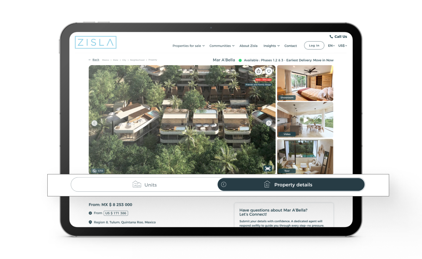
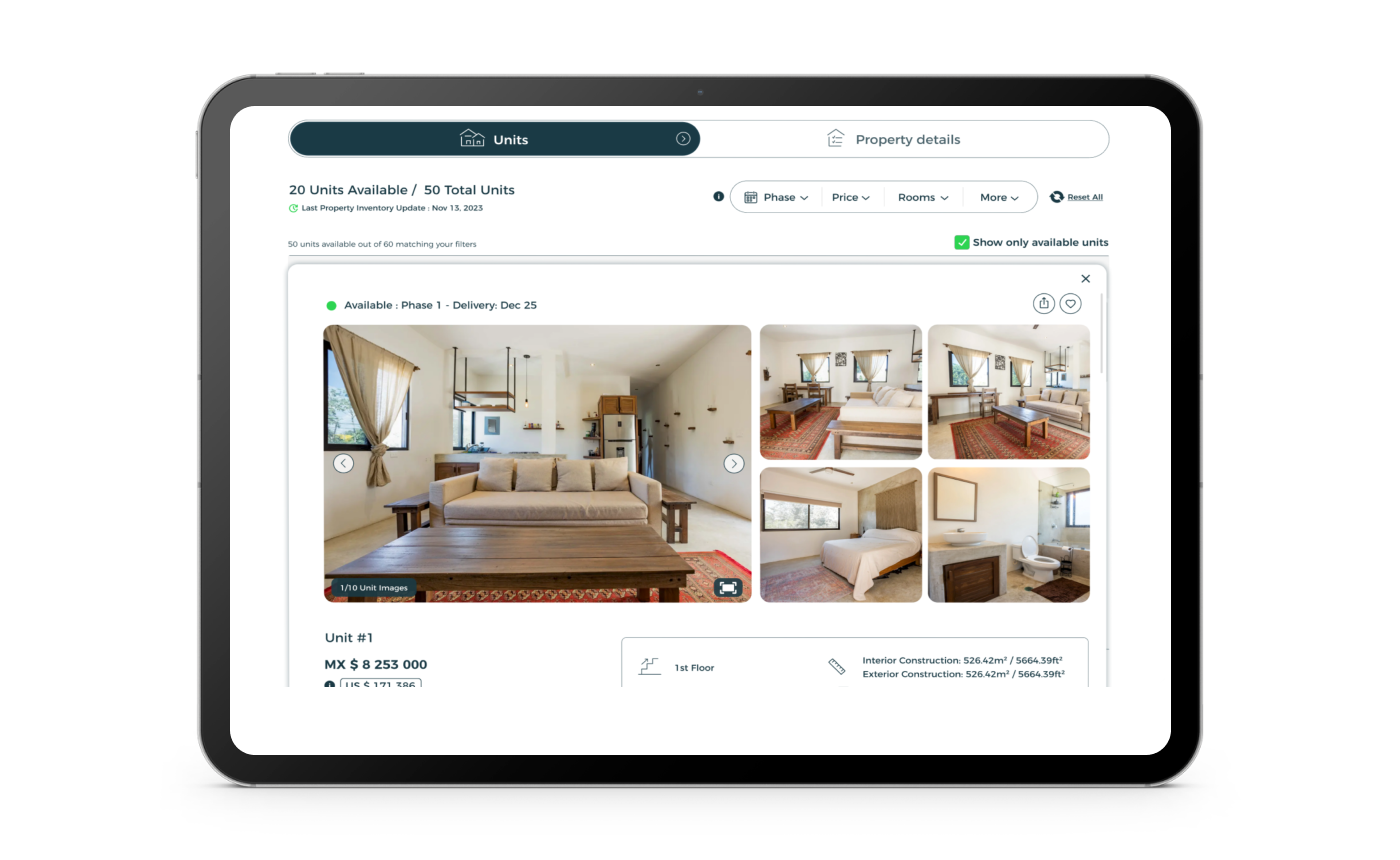
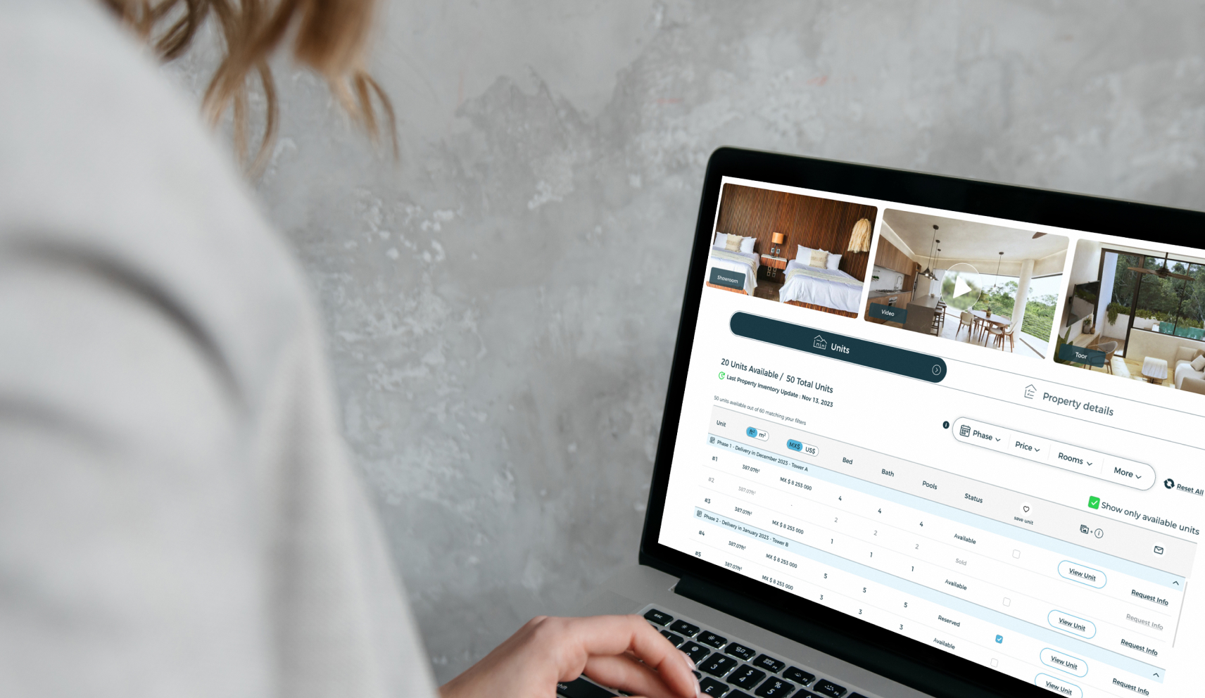
To aid in user navigation, we incorporated advanced filters, enabling users to efficiently sort through units based on their preferences. A scrollable table was added to display essential unit information succinctly, and for further details, we integrated a detailed popup for each unit, offering an in-depth look at specific features and amenities.
Recognizing the unique appeal of luxury properties, we introduced a distinct style for these listings. Larger cards were used in a list-only view format, emphasizing the high-end nature and exclusivity of these properties. This specialized design approach helped in distinguishing the luxury collection, making it stand out and appeal to the high-end market segment.
Understanding the variety in property and unit types on Zisla’s platform, we developed an adaptable design framework. This flexible approach ensured that our design could accommodate a wide range of listings, including those without specific pricing or inventory details, thereby catering to the diverse portfolio of Zisla.
Before After


We believe in value. Value that makes the difference in your results, without the uncomfortable conversation to upsell an extra item with a price tag. MK-Way regularly goes above and beyond because we genuinely care about the people we work with. Here are a few value-added items that we prepared for Believe as our way of showing our appreciation for their business.


