Tools Used

Be Brilliant Tutoring, based in New York, empowers children ages 4-14 to unlock their unique potential through the Gattegno method, which centers on the idea that every child has a natural brilliance waiting to be discovered. This approach helps children overcome learning challenges with confidence. When Be Brilliant approached us, their website wasn’t attracting enough new clients.

Our initial UI/UX audit revealed key issues: underdeveloped branding, unclear messaging, and a confusing website structure that impacted their credibility. These insights led us to develop a complete brand and website redesign.

Client — Be Brilliant Tutoring
Location — New York, NY
Industry — Tutoring Center

Scope:

BRAND STRATEGY IDENTITY DESIGN WEBSITE (UI/UX) DESIGN CONTENT STRATEGY ANIMATION WEB DEVELOPMENT

The biggest challenge was capturing the essence of Be Brilliant’s distinctive teaching approach. While Gattegno’s method is a strong foundation, many other centers also promote specialized methods. To stand out, we needed to dive deep into Be Brilliant’s philosophy and clearly communicate what makes their approach transformative. Leveraging our background in developmental psychology, we developed messaging and tools that showcases Be Brilliant’s unique ability to inspire lifelong learning.

Brand Development

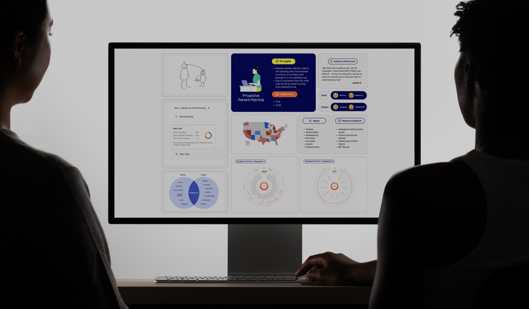
  • Target Audience Research: Through careful research, we identified the specific pain points of Be Brilliant’s target audience. Our findings helped us refine messaging to resonate with parents looking for impactful learning solutions for their children.
  • Distinct Messaging and USP: We crafted six clear selling points that highlight Be Brilliant’s unique approach and developed seven versatile taglines that capture the essence of their brand.
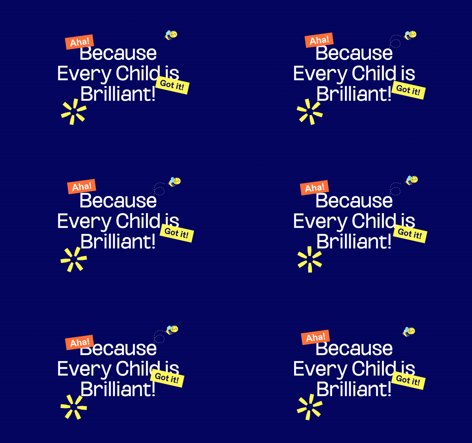
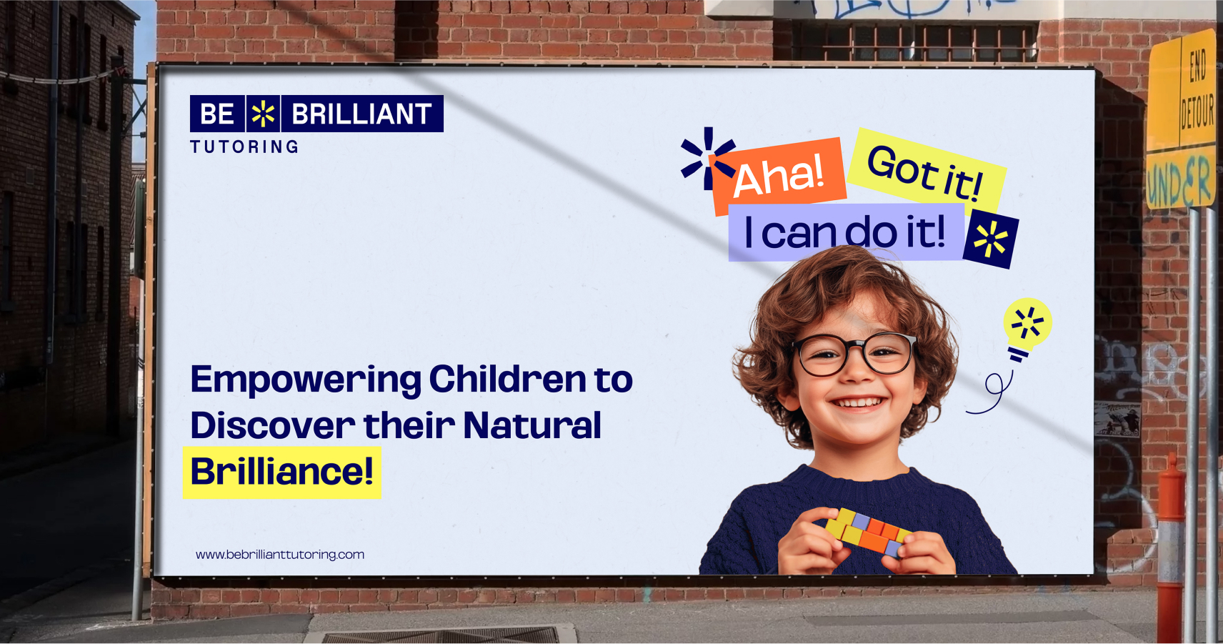
  • The “Aha!” Moment:We identified the “Aha!” moment as a central concept in Be Brilliant’s philosophy.  It is the instant a child understands a challenging concept, sparking confidence and curiosity. Similarly we introduced the concepts ‘I Can Do It!’, and ‘I Got It!’ to capture the confidence-boosting moments students experience. We emphasized these themes visually and verbally throughout their branding to communicate the joy and excitement of learning.
  • Competitive Differentiation Through a Comparison Table: During our research, we discovered that while Be Brilliant Tutoring and its competitors often use similar terms like “self-learning,” “confidence,” and “personalized learning,” they each mean something quite different by them. Be Brilliant wasn’t initially aware of this difference, but we identified it as a key distinction that would set them apart in a meaningful way. To communicate this clearly, we created a comparison table that highlights how Be Brilliant’s approach provides a deeper, more transformative learning experience. This table not only differentiates Be Brilliant from competitors but also educates parents, showing them the genuine, impactful benefits of choosing Be Brilliant for their child’s development.
  • BBT Guarantee: We introduced the “BBT Guarantee” as a way to assure parents of measurable learning outcomes, reinforcing Be Brilliant’s credibility.
  • Brand Blueprint: We developed a comprehensive brand blueprint that serves as a reference for consistent messaging and communication, helping the entire team stay aligned with Be Brilliant’s mission.
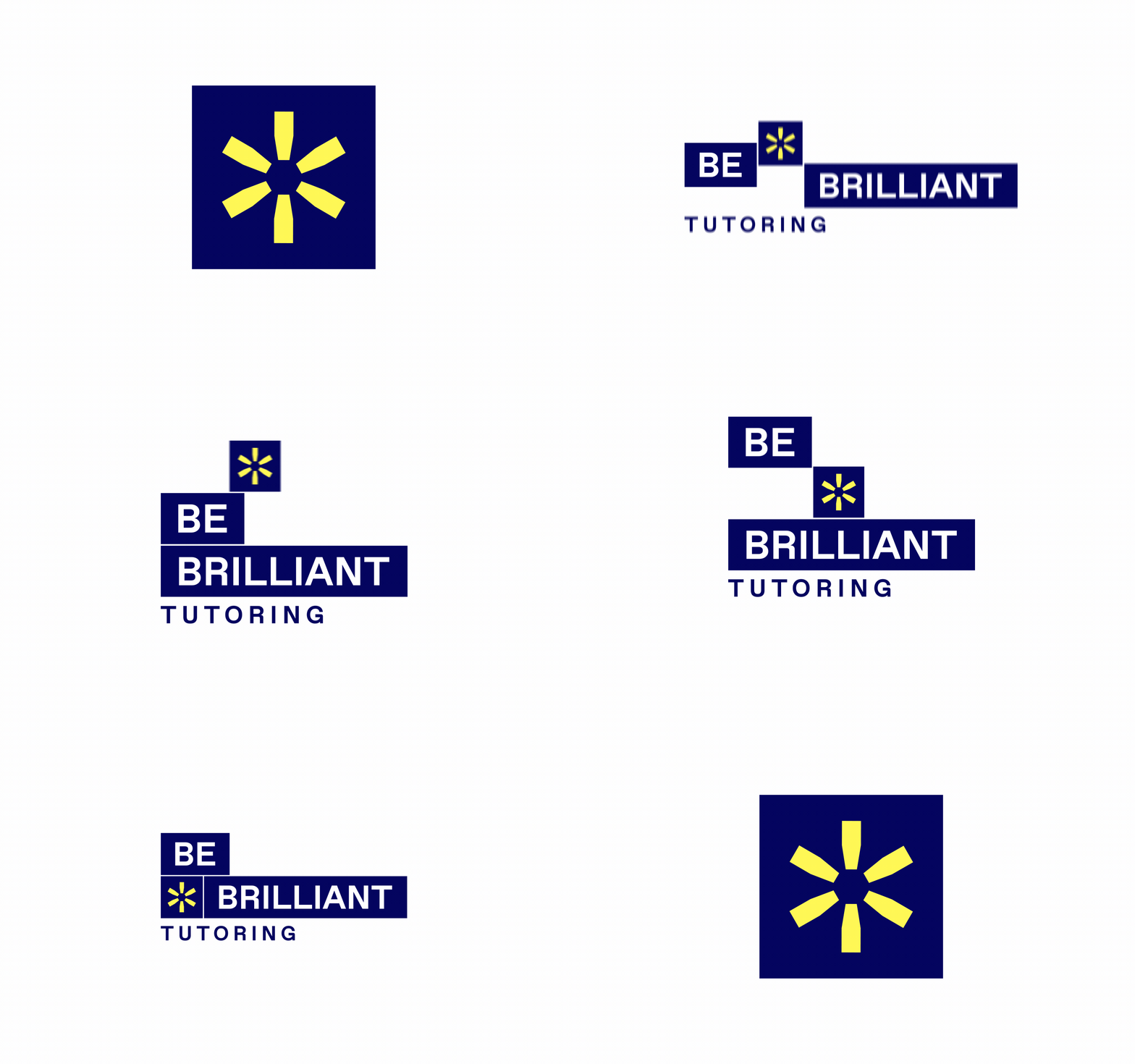
  • Logo Design: The final logo is a multifunctional design directly inspired by the Gattegno rods, central to Be Brilliant’s teaching approach. The logo reflects how children combine rods to grasp new concepts, symbolizing learning as a dynamic, hands-on process. It includes a spark element—a blend of a star and exclamation mark—that represents both the child’s brilliance and the discovery aspect of the “Aha!” moment.
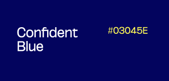
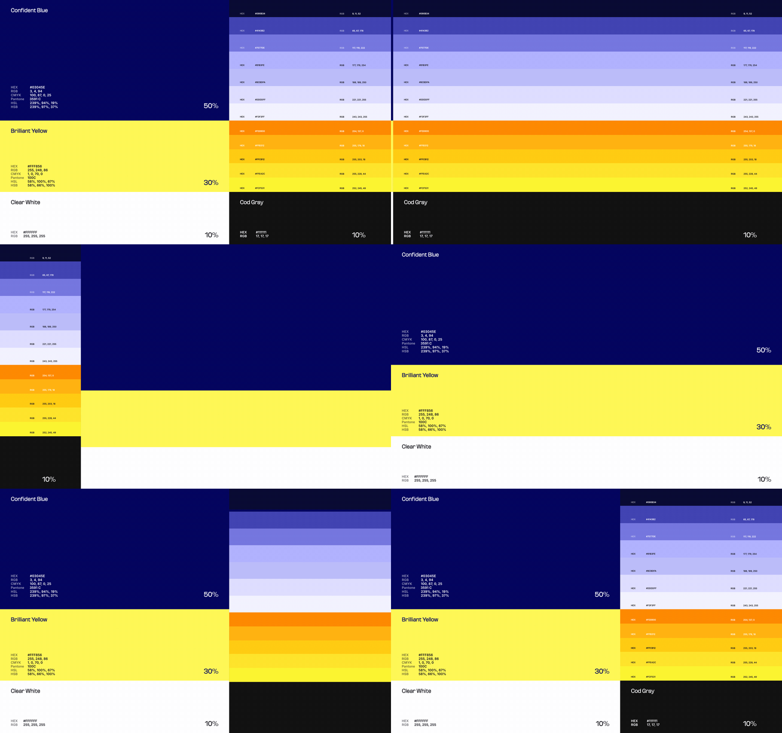
  • Primary Color Palette: We chose a deep blue for trustworthiness and a bright yellow for excitement and energy, perfectly aligning with Be Brilliant’s mission of fostering joyful, impactful learning.
  • Graphic Elements: Building on the core themes of “Aha!”, “I Can Do It!”, and “I Got It!”, we designed visual elements inspired by the Gattegno rods. These graphics visually reinforce the learning journey and can be used seamlessly across both digital and physical spaces, creating a consistent and recognizable brand presence. In addition to these core visuals, we developed other graphic elements derived from the logo’s spark symbol, further expanding the BBT visual ecosystem. This cohesive system allows for a branded environment where each element, from classroom decor to digital assets, reflects Be Brilliant’s philosophy and unique identity.

AI-Generated Imagery

To give Be Brilliant a distinct visual identity, we used AI to create unique, custom images that reflect their teaching philosophy, avoiding the limitations of generic stock images. Combined with the new graphics, these images establish a fresh, cohesive visual style that brings Be Brilliant’s mission to life.

Before
After

20% MORE FOR BE BRILLIANT

We believe in value. Value that makes the difference in your results, without the uncomfortable conversation to upsell an extra item with a price tag. MK-Way regularly goes above and beyond because we genuinely care about the people we work with. Here are a few value-added items that we prepared for Believe as our way of showing our appreciation for their business.

1. We did 3 times more in depth research and positioning development

2. We developed a comparison chart to communicate the BB!T difference on the website and independently

3. We made 3 additional brand font recommendations for access through Canva

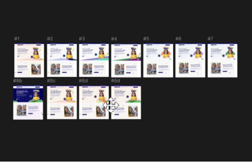
4. We developed 11 additional creative directions for the website

5. We developed 3 additional colour palettes for the website

6. We developed the content strategy for the website

7. We created 2 additional social media cover designs

The MK-Way “WOW” effect

More Stellar Work

SURF

Branding & Visual Identity

BELIEVE Inc.

Branding & Visual Identity

GadiMed

Branding & Visual Identity

AmenClinics

UX Research

INNERSPACE

IA, UI/UX

1Life2Love

Branding, Visual Identity & UI/UX

Northwest Supplies

UI/UX, Custom Shopify Store

RCAS

Branding, Visual Identity & UI/UX