Precious Angels Preschool is a childcare and early education center with a strong focus on STEAM (Science, Technology, Engineering, Art, and Math). When co-owners Tammy and Emmy came to MK-Way, they were looking for a website. But as soon as we reviewed their current materials, we knew a new website alone wouldn’t solve the bigger problem—their brand identity didn’t reflect the high-quality, thoughtful education they offered. We recommended a “mini identity” package that would help reintroduce Precious Angels to the world with a fresh, modern brand that speaks to both children and parents. The goal was to develop an identity that reflects their joyful, science-forward learning environment and pairs beautifully with their new website.
Client — Precious Angels Location — Colorado, United States Industry — Kids Preschool
Scope:
BRAND IDENTITY DESIGN WEBSITE (UI/UX) DESIGN
Challenges
Our main challenge was to create a visual identity that appealed to both kids and parents while also showing the school’s commitment to a structured, science-based curriculum. We needed to find a balance between playful and professional—something that would stand out from other preschools while staying true to the unique STEAM approach that makes Precious Angels special.
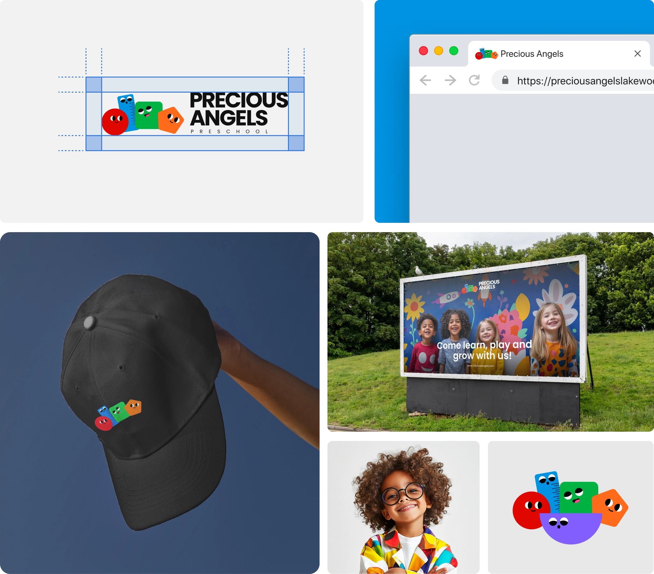
Another challenge was to create something versatile. The identity had to work not just on the website, but across different platforms and materials like signs, brochures, and digital communication with families.
Our Solution
Visual Identity & Branding
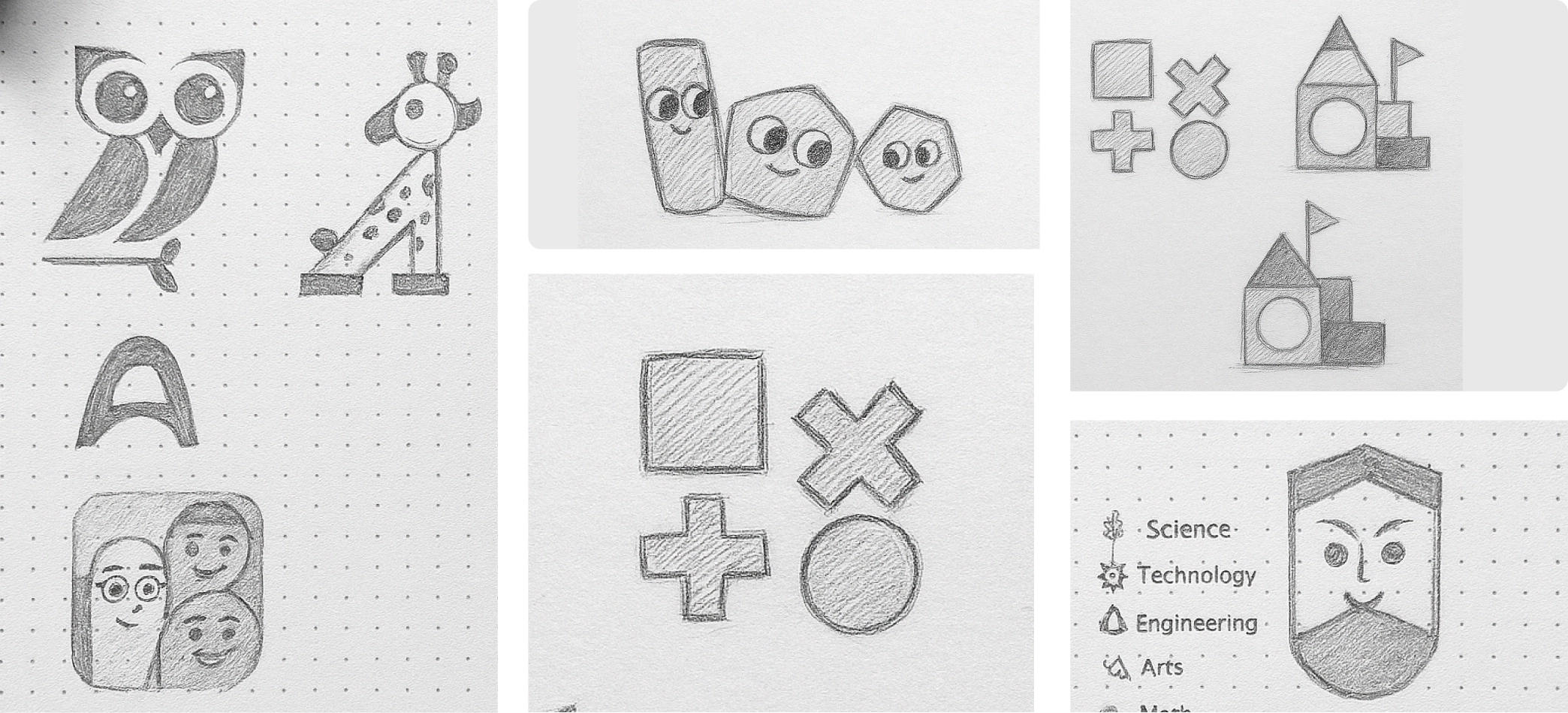
After our brand strategy call, we created moodboards to explore styles that felt joyful, playful, and educational. We focused on bright primary colors and simple shapes that connect with early childhood education. The client loved the direction, and from there we developed seven different logo concepts. One clear winner emerged.
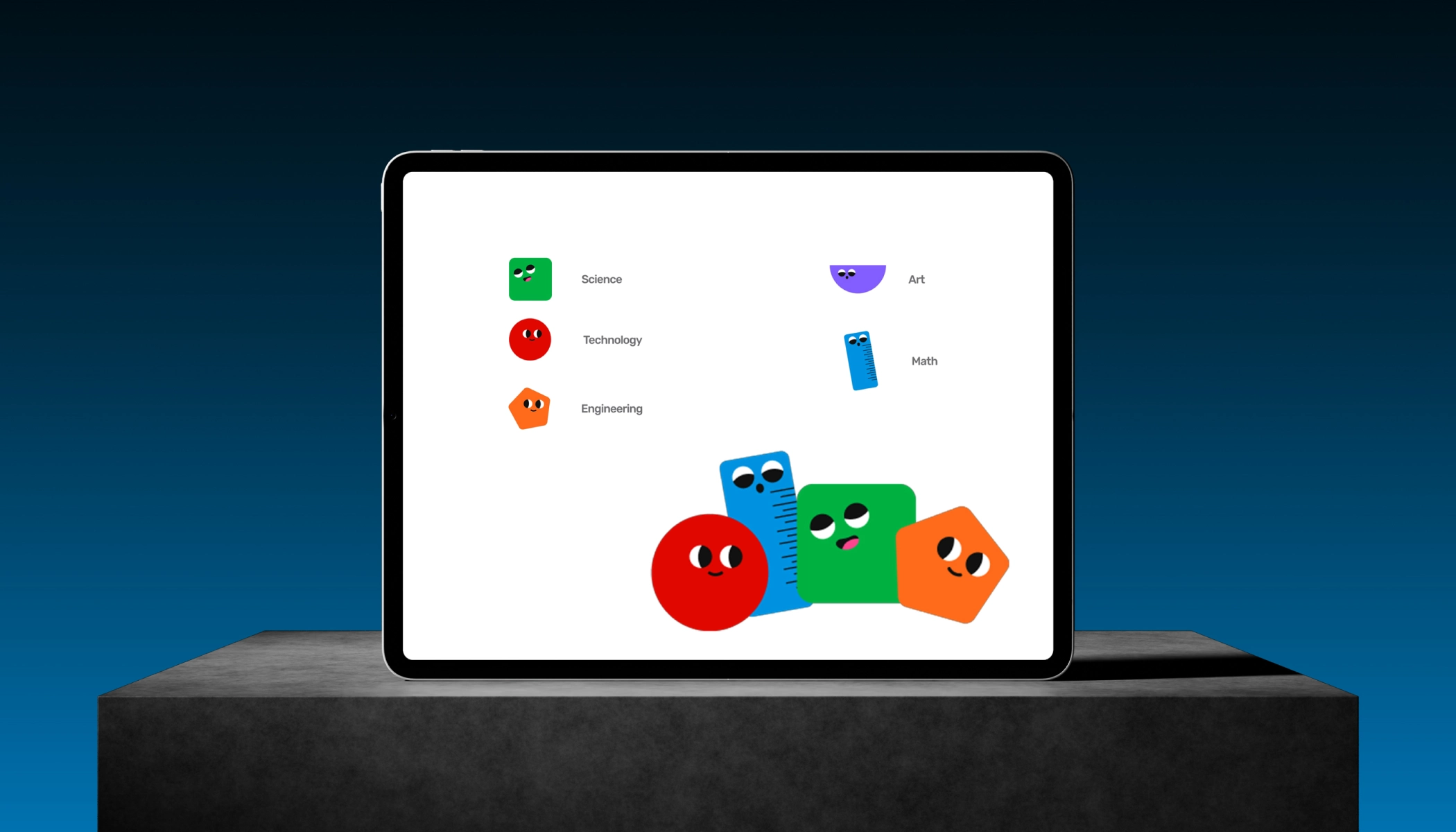
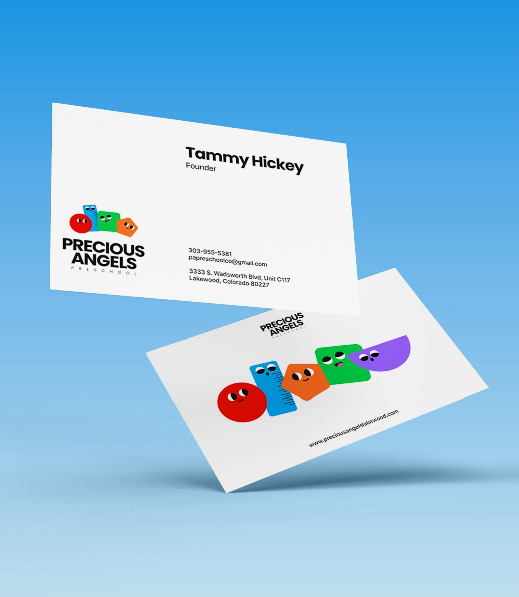
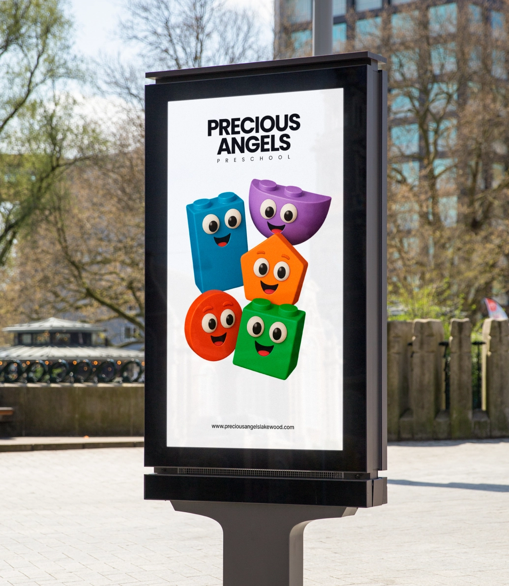
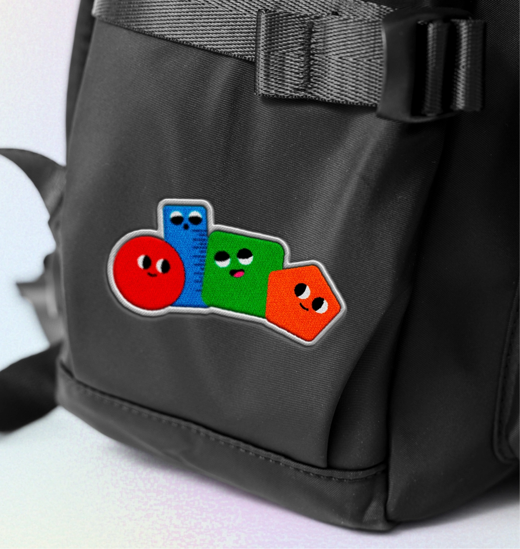
The final logo is made of four main shape characters and a fifth supporting one:
A green square for Science
A red circle for Technology
An orange pentagon for Engineering
A blue ruler for Math
A purple semicircle for Art (used in extended brand elements)
Each shape is more than just a symbol—it’s a friendly, standalone logo element that can be used throughout the brand. Together, they tell the story of Precious Angels’ STEAM-based learning in a way that’s simple, fun, and easy to understand for both kids and adults.
Logo Visual System
We created a color-coded system that connects each subject area with its shape. These visual cues make the brand flexible and fun to apply across signage, classroom materials, printed content, and digital experiences. The shapes can live independently or come together as a unified logo, making the system versatile for any use.
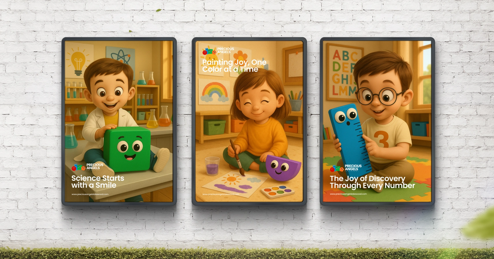
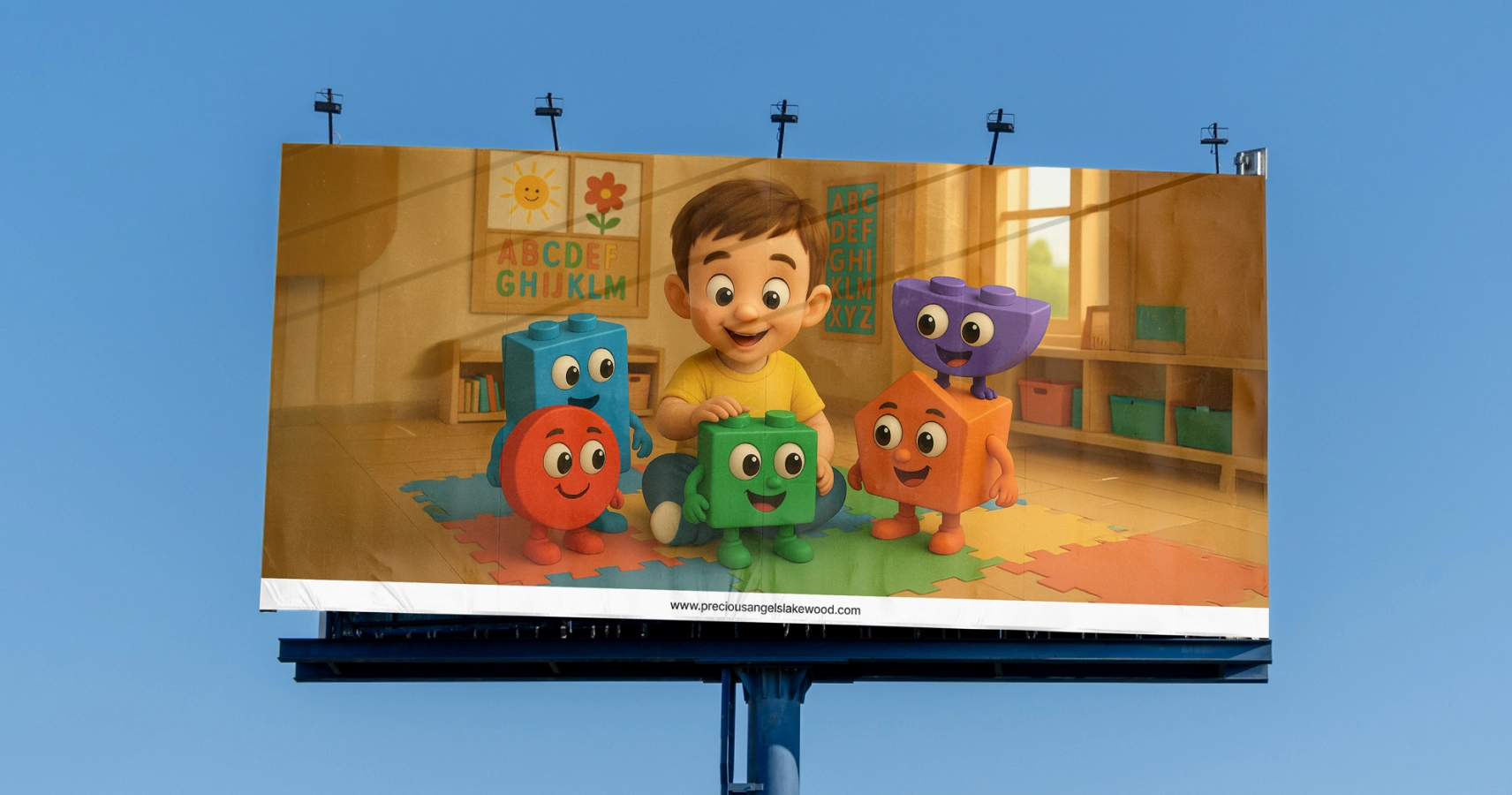
AI-Generated Brand Imagery
We developed a set of over 50 playful, AI-generated images that brought the brand to life in a truly creative way. Each image showcased different aspects of the Precious Angels identity—from little scientists and engineers to imaginative classroom scenes. These visuals captured the innovative and STEAM-driven nature of the preschool while also celebrating inclusivity, featuring children of different backgrounds, appearances, and abilities. Designed to align seamlessly with the visual identity, they added warmth, personality, and a sense of wonder to the website and brand communication materials.
3D Logo Character Concept
As a fun, extra layer of expression, we used AI tools to render one of the shape characters in 3D. This creative touch adds dimension and visual interest that can be used selectively in communication materials.
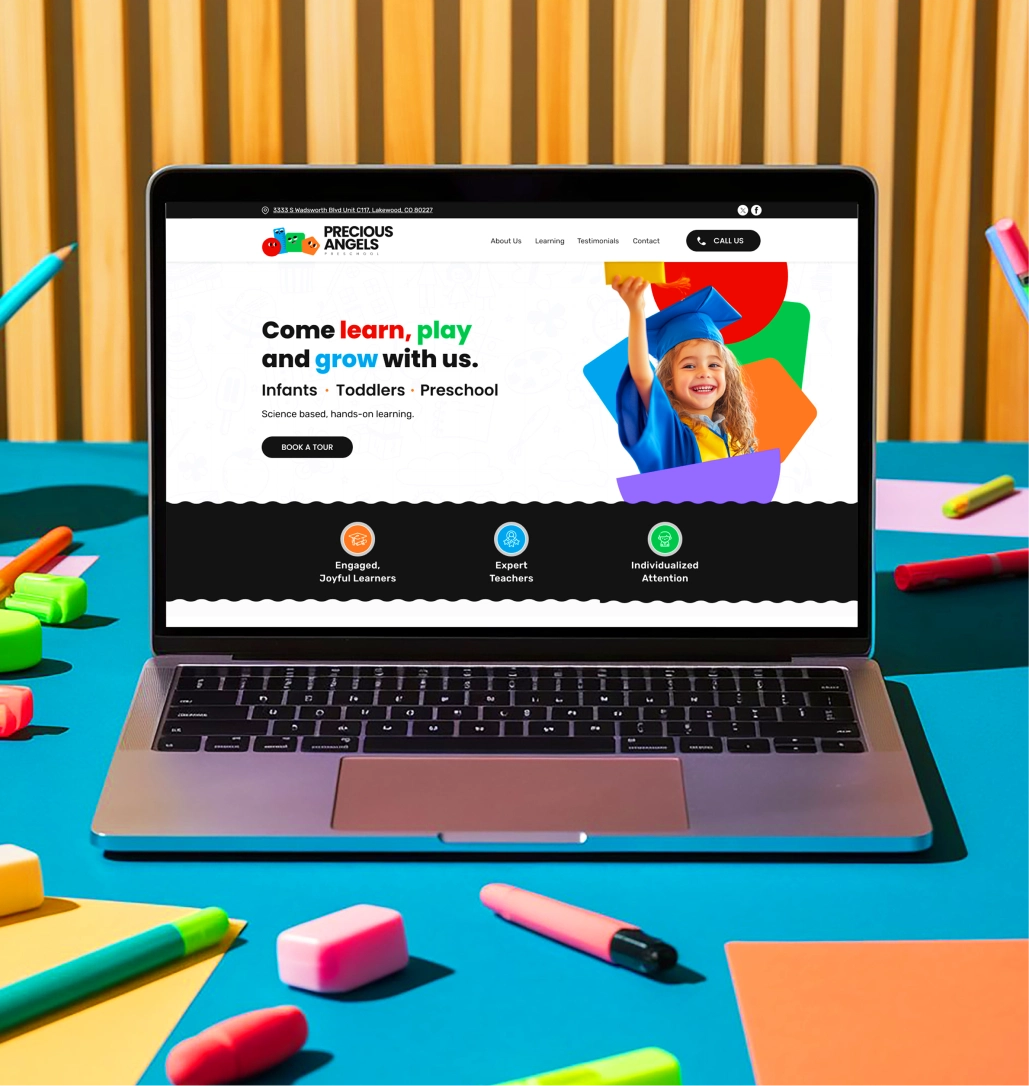
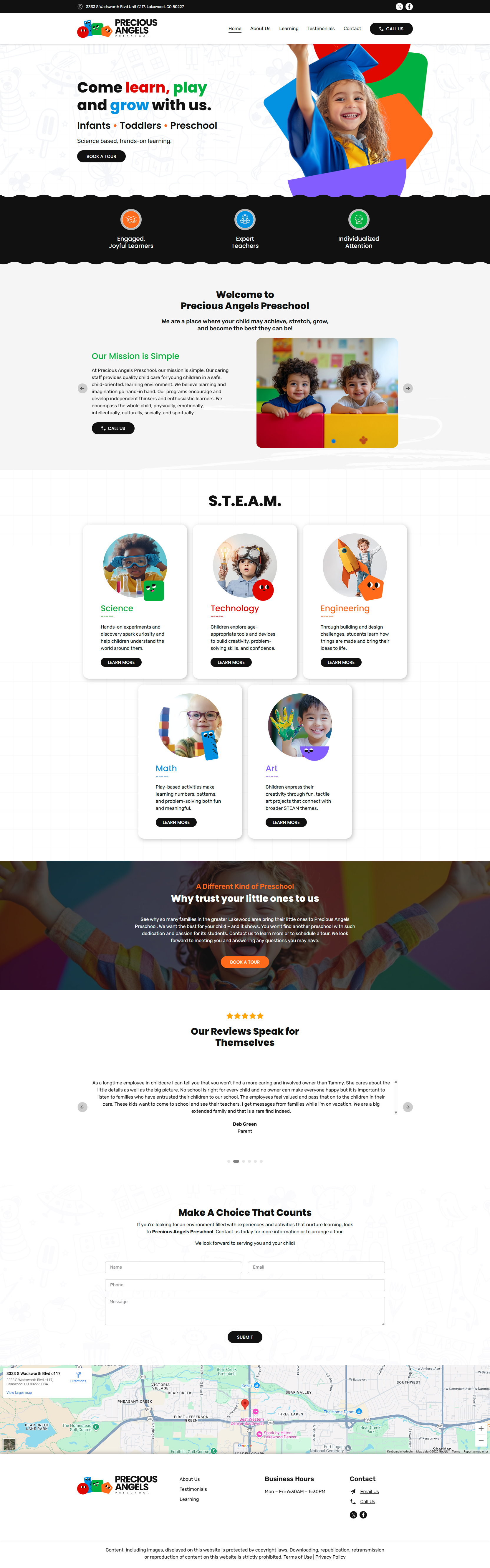
Website Design
Once the identity system was complete, we moved on to designing a website that was clean, simple, and highly user-friendly. We know from experience that parents of infants and toddlers are often overwhelmed when searching for the right school, so our goal was to provide a calm, easy-to-navigate experience that immediately builds trust.
We applied the full color-and-shape subject system directly into the website’s layout. Each STEAM subject is represented with its dedicated color and icon, which helps parents quickly understand what the school offers and how it aligns with their child’s learning journey. The website also integrates the playful AI-generated images in key sections to bring the brand to life visually. Everything—from the copy to the visuals to the layout—was built to reflect the school’s unique mix of joy and scientific curiosity.
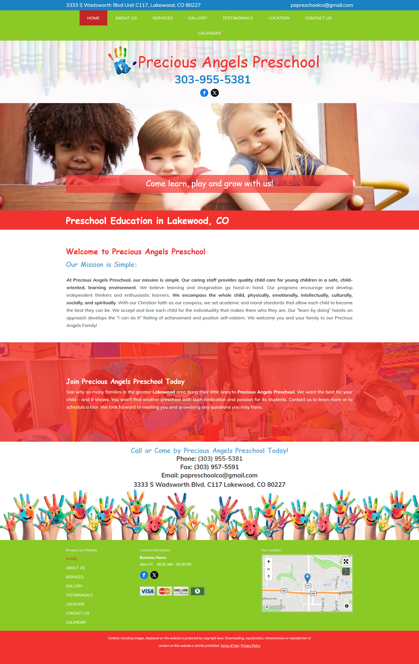
Before and After MK-Way
Before After
20% MORE FOR BELIEVE
We believe in value. Value that makes the difference in your results, without the uncomfortable conversation to upsell an extra item with a price tag. MK-Way regularly goes above and beyond because we genuinely care about the people we work with. Here are a few value-added items that we prepared for Believe as our way of showing our appreciation for their business.
1. We created a 5th, extra visual identity option!
2. We designed and implemented 2 additional website pages.
3. We created 6 additional AI branded images.
4. We developed a comprehensive content strategy for the website.
5. We created a logo “Wallpaper” pattern and an Adobe Illustrator pattern generator (swatch).
6. We designed custom premium branded illustrations.