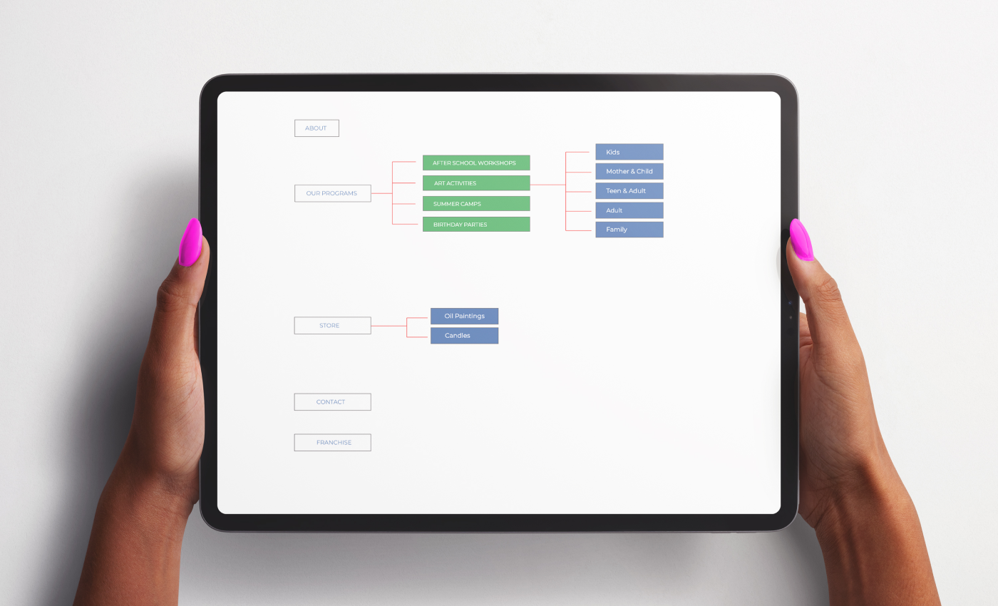
1Life2Love, with a physical warehouse as their base, aimed to create a creative haven for individuals seeking an outlet. They offered after-school activities, hosted events, workshops, and also sold oil paintings and candles.
They approached MK Way to help them solve their dual-business problem within a single branding solution and visual identity. The client’s vision was to promote happiness, encourage disconnection from technology, and foster a community for families and friends to bond over creative activities.
BRAND STRATEGY IDENTITY DESIGN SHOPIFY WEBSITE (UI/UX) DESIGN WEB DEVELOPMENT
Challenges
Our biggest challenge was reconciling the dual nature of their business. On one hand, they had a beautiful studio offering art activities (i.e, paint night), while on the other hand, they wanted to sell oil paintings both in-studio and online. The branding challenge lay in seamlessly merging these two distinct facets into a cohesive and strong brand identity. To address this, we focused on colour as a key solution, as explained in the following sections.
Solutions
Branding
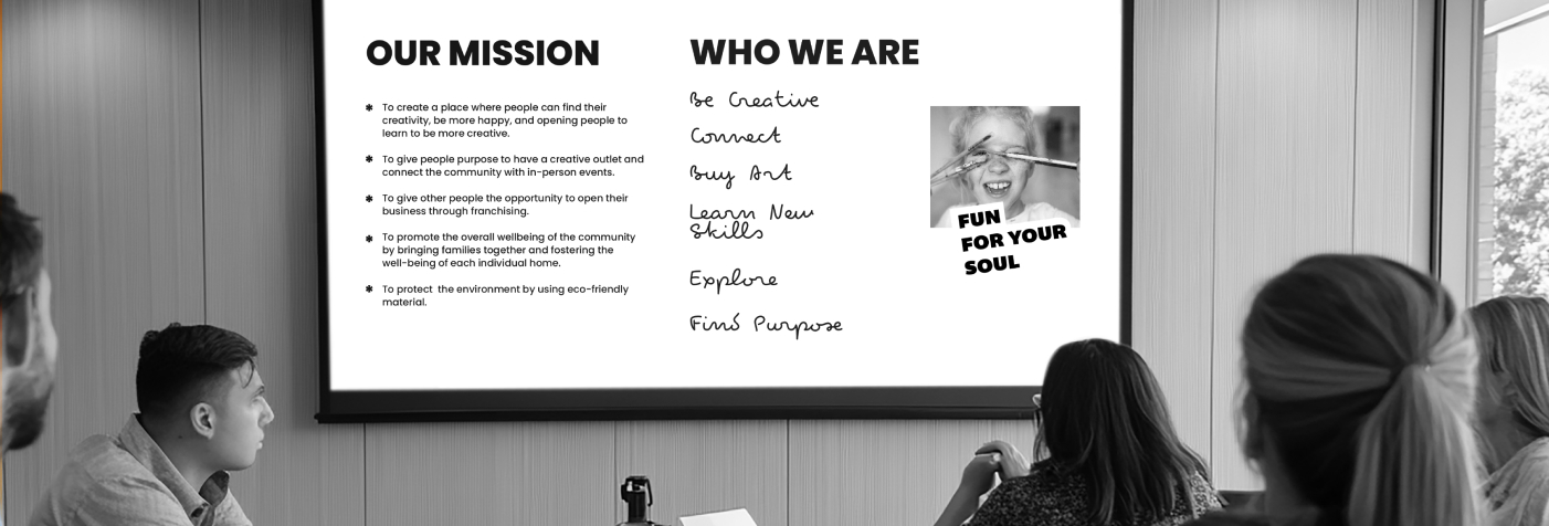
First, we conducted an in-depth brand excavation phase to identify their buyer personas, define their vision & mission, and craft their brand story & tone of voice. This process ultimately led to the creation of their main slogan:
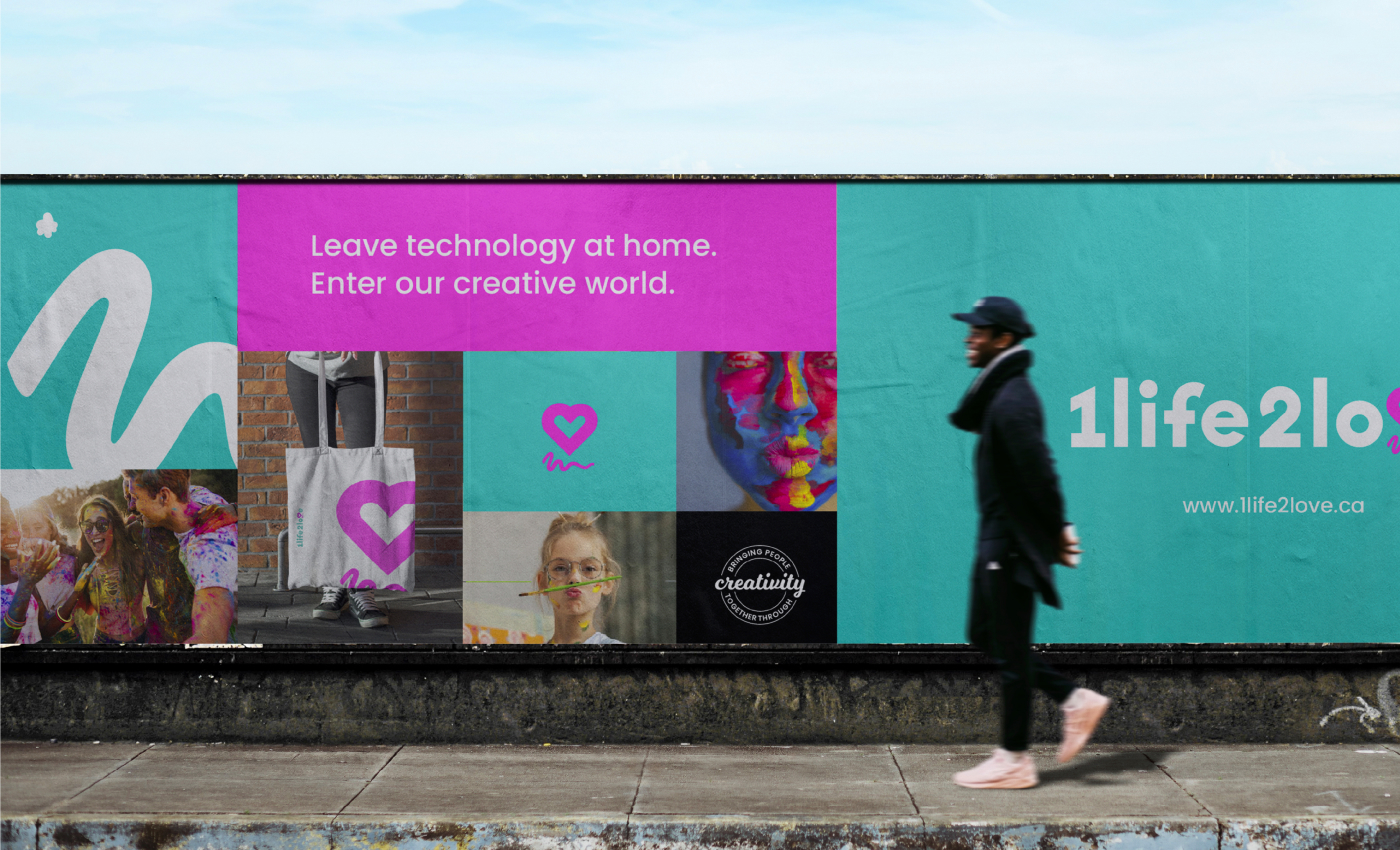
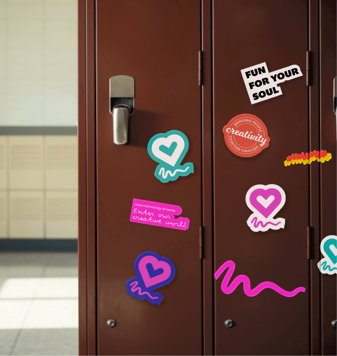
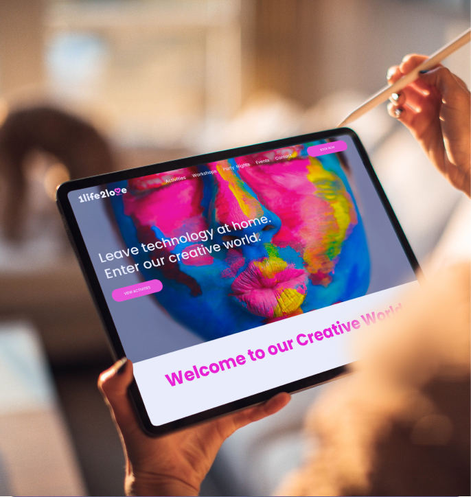
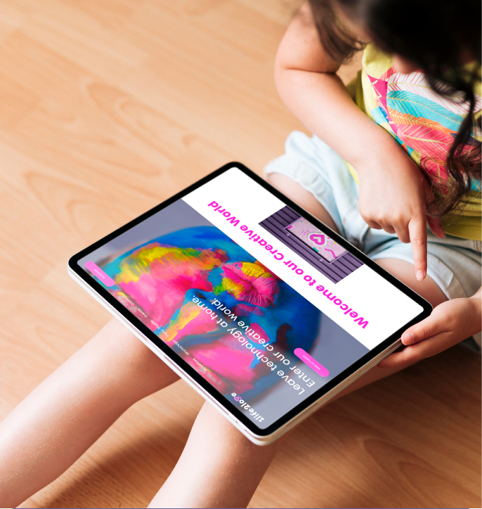
Leave technology at home. Enter our creative world.
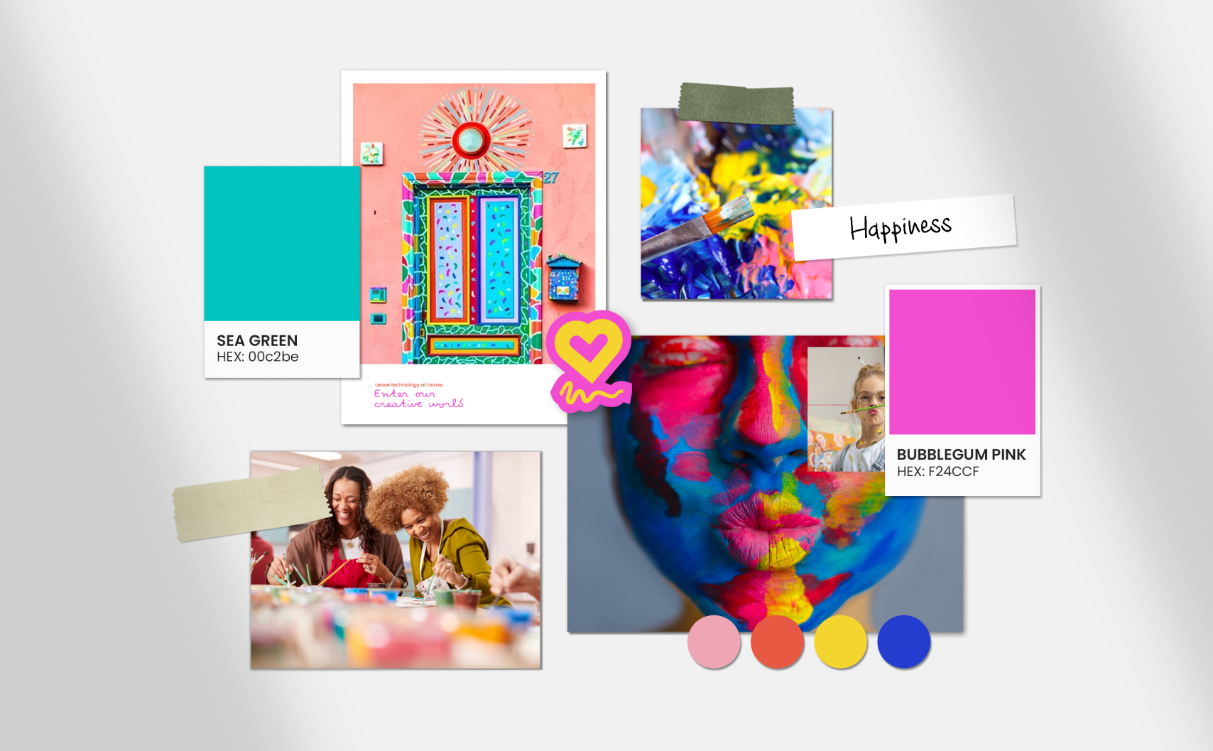
Moodboards
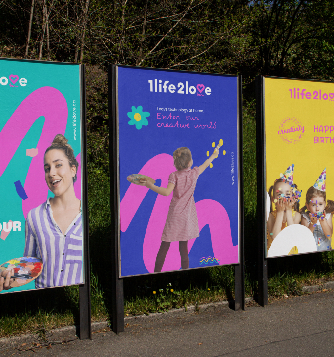
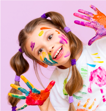
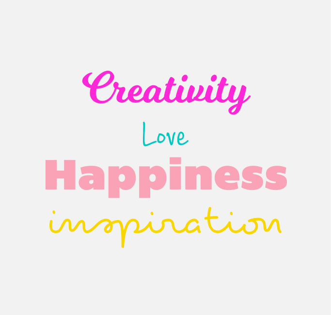
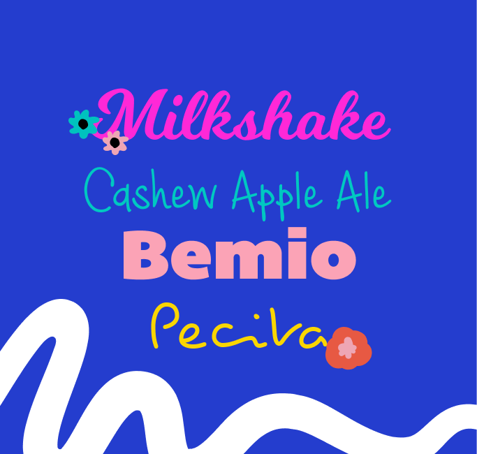
Next, we developed mood boards that visually represented the brand’s unique personality. We opted for a playful and happy look and feel, employing energetic imagery, modern fonts with a touch of playfulness, and vibrant colours that evoked a sense of joy and inspiration. This exploration led us to the development of the logo and colour palette.
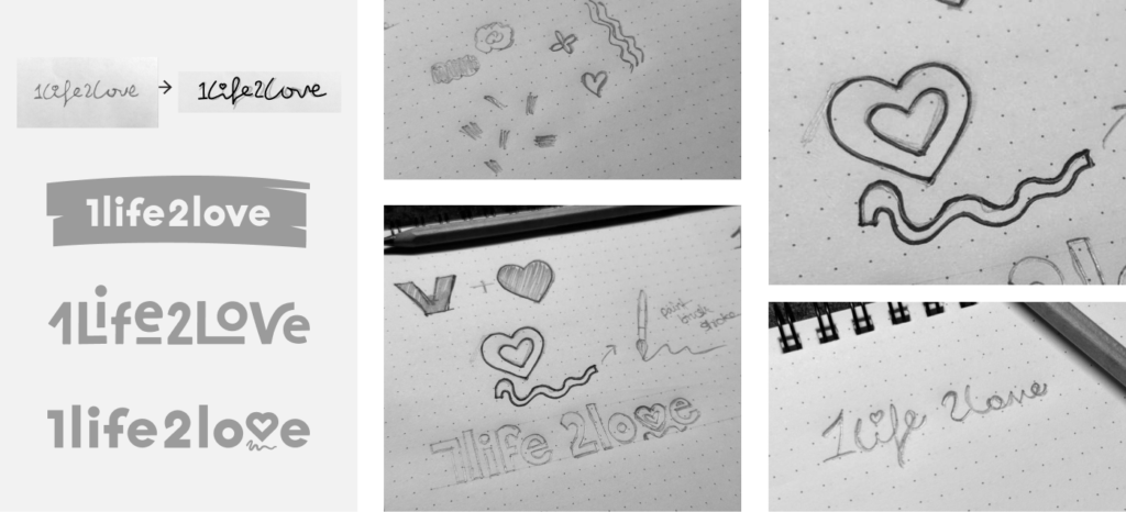
Brainstorming & Sketching
We sketched out different logo ideas by playing around with custom lettering, heart symbols, and creative strokes to capture the brand’s artistic vibe and make the design flexible.
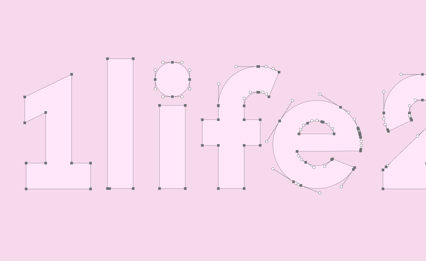
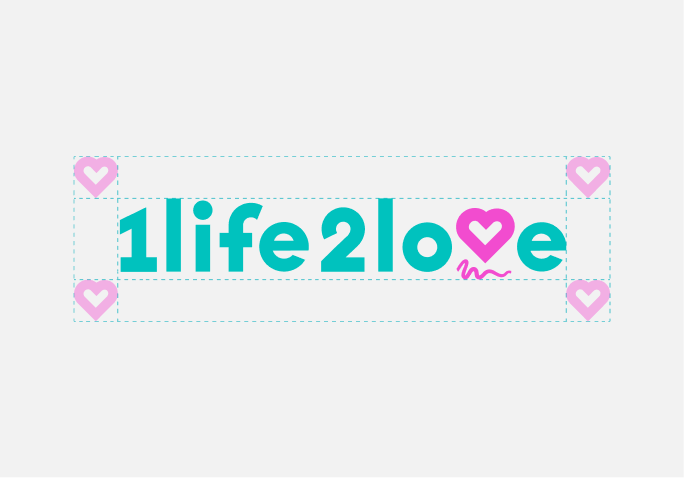
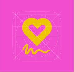
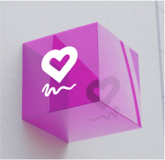
The Logo
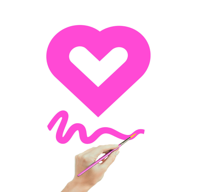
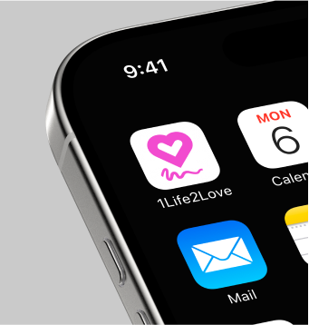
The logo featured custom lettering, with the letter “V” in “Love” replaced by a heart symbol to symbolize love and a paintbrush stroke-like line underneath to represent the artistic nature of the business. This unique logo design allowed for both the full logo and the symbol to be used separately, providing flexibility in application.
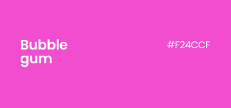
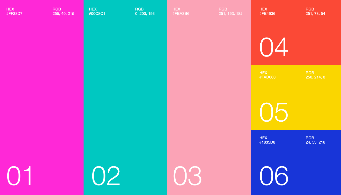
Color Palette
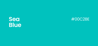
We selected a combination of Deep Sea Blue, Turquoise Blue, and Soft Aqua to evoke feelings of trust, calmness, modernity, and energy. This palette was designed to make the audience feel optimistic and reassured. The black color is to add contrast and convey the messiness of the creative process. Our color palette was designed to create feelings of enthusiasm and happiness!
Color Pairings
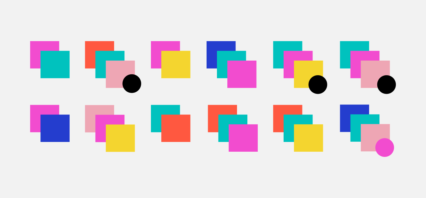
We created a colour pairing guide that simplifies the process of selecting harmonious colour combinations. This ensures consistent and visually appealing designs across all brand materials. The circles suggest adding that colour in smaller amounts.
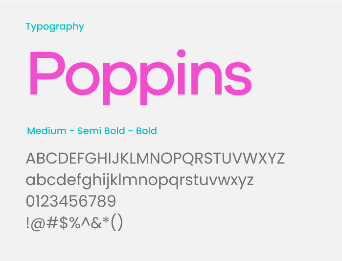
Typography
Secondary typography plays a supporting role in your brand’s visual identity, complementing the primary font while adding depth and versatility. It’s perfect for subheadings, captions, or body text, balancing the design and enhancing readability.
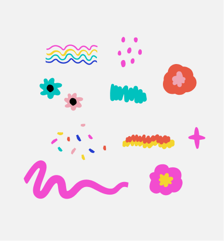
Graphic Elements
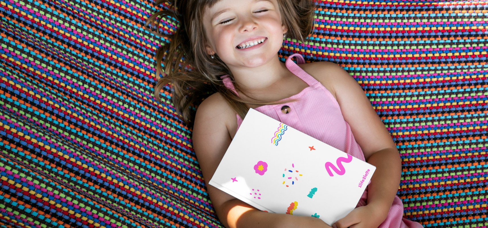
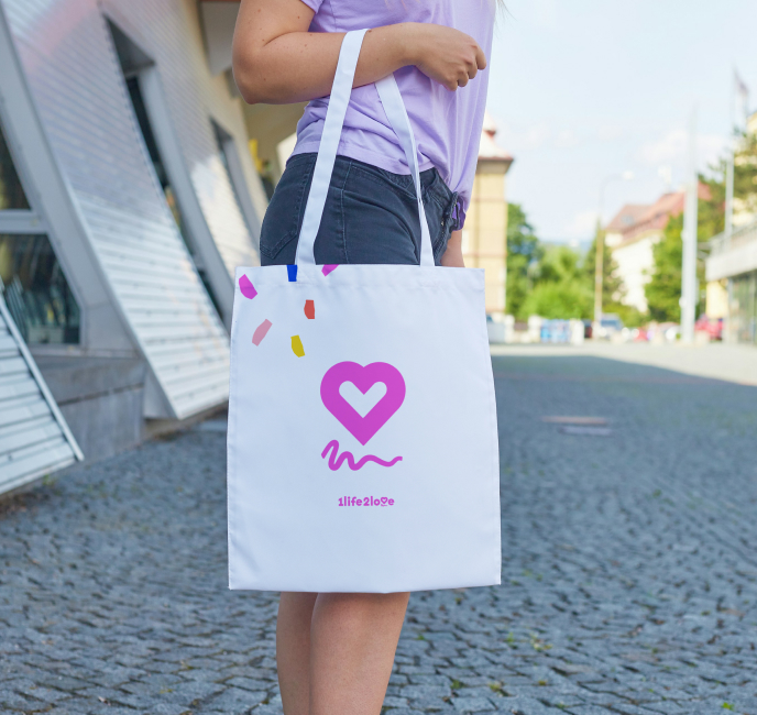
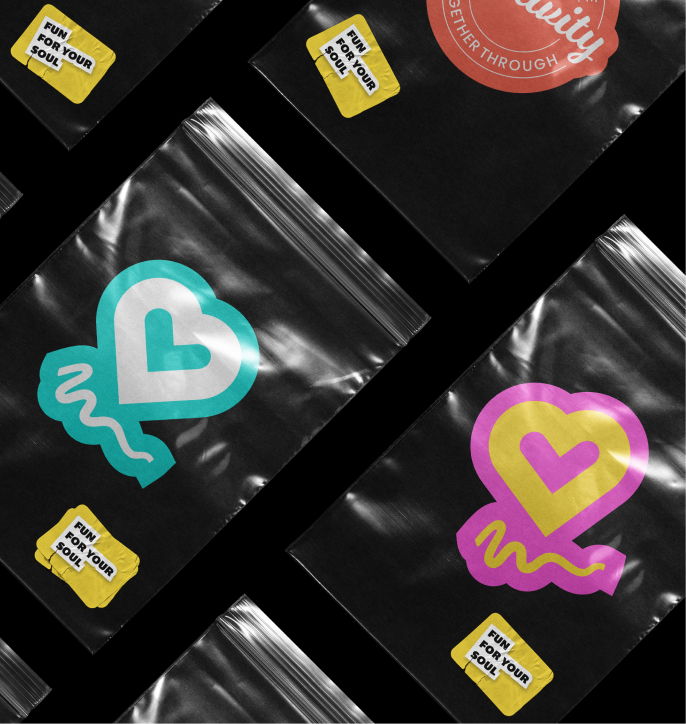
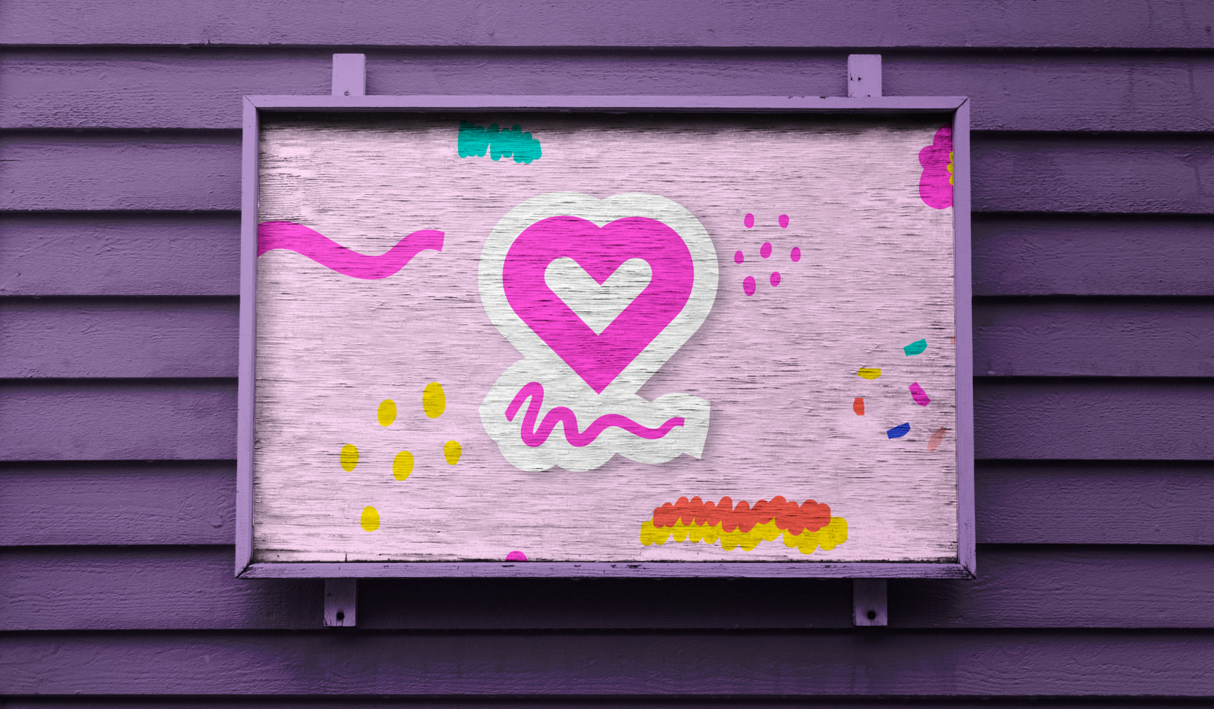
Lastly, inspired by the mood boards, we created hand-drawn graphic elements that could be used across various applications to enhance the brand identity. We also developed a series of “digital stickers” utilizing the symbol and various slogans of the company. These stickers could be utilized online and printed for use on organic box packaging and tote bags, serving as a unifying element between the online and offline identity. They added a playful touch and allowed customers to spread the love and company message.
Website Design
To facilitate wholesale operations, we streamlined the wholesale process through the “Wholesale Gorilla” Shopify app, offering tailored pricing and discounts for B2B customers.
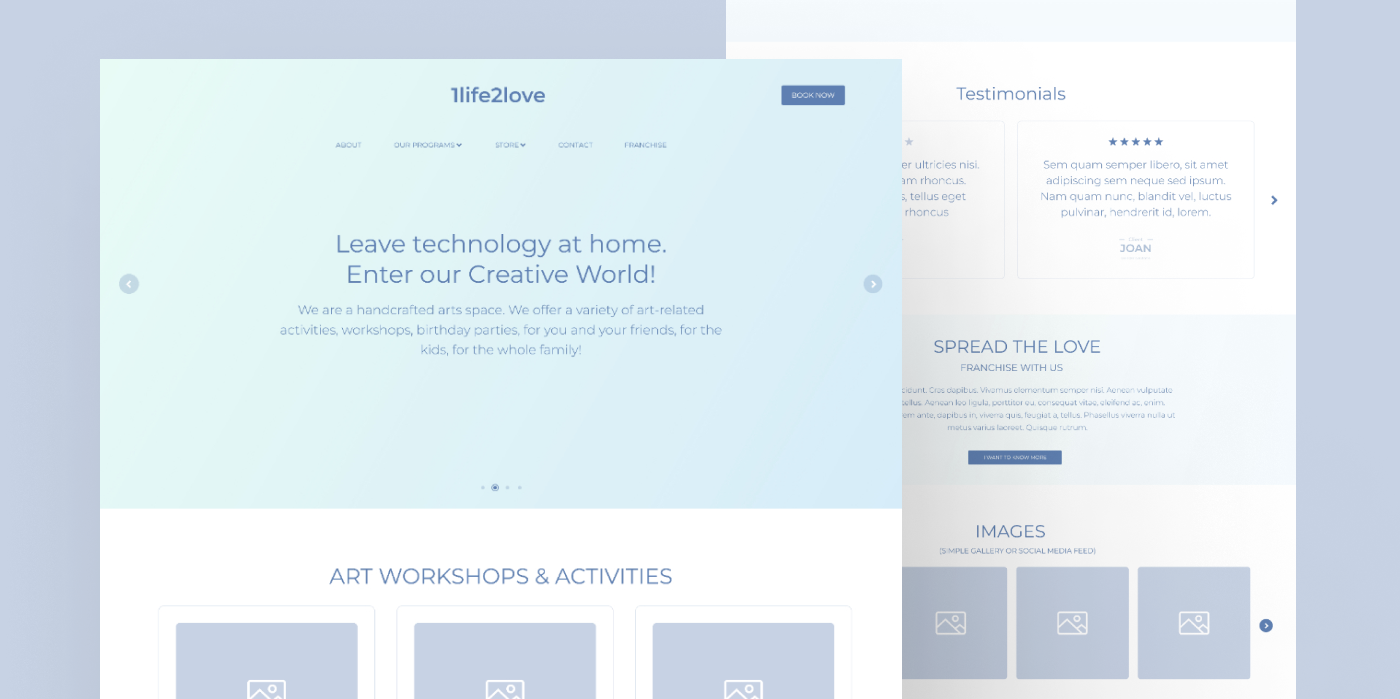
Website (UI/UX) Design
We implemented a user-centric design philosophy, utilizing the new brand identity and AI-generated imagery to create a responsive, modern, and user-friendly website. The design reflected the new brand ethos, ensuring a seamless and engaging user experience.
20% MORE FOR BELIEVE
We believe in value. Value that makes the difference in your results, without the uncomfortable conversation to upsell an extra item with a price tag. MK-Way regularly goes above and beyond because we genuinely care about the people we work with. Here are a few value-added items that we prepared for Believe as our way of showing our appreciation for their business.
1. We created a 5th, extra visual identity option!
2. We designed and implemented 2 additional website pages.
3. We created 6 additional AI branded images.
4. We developed a comprehensive content strategy for the website.
5. We created a logo “Wallpaper” pattern and an Adobe Illustrator pattern generator (swatch).
6. We designed custom premium branded illustrations.