Tools Used


What to do when your website no longer stimulates business growth? Many companies are focused on providing top-notch service but often fail to show the world what they are made of.
In the case of RCAS we were presented with an outdated website that was far from representing their expertise in crisis management and security. Although the company believed they needed a website, they actually needed a complete re-branding that would tell their story and speak credit to their years of experience.
We were tasked with creating clarity and showing their potential clients that they were in safe hands.
Client — RCAS
Location — Canada
Industry — Crisis Management
BRAND STRATEGY
IDENTITY DESIGN
WEBSITE (UI/UX) DESIGN
WEB DEVELOPMENT
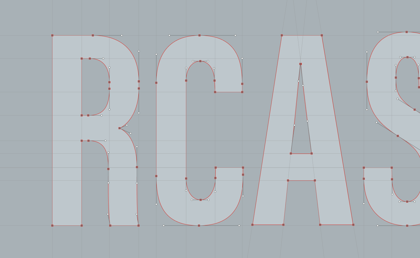
The primary challenge for RCAS was not only to redesign their logo but also to comprehensively reposition the brand and develop a compelling narrative that would resonate deeply with their target audience. This involved creating a visual identity and brand story that accurately reflected their values of trust, discretion, and integrity, while also highlighting their extensive experience in crisis management.
We needed to ensure that the new branding effectively communicated the essence of RCAS, balancing their rich history with a modern, forward-thinking approach to attract and engage their diverse clientele.
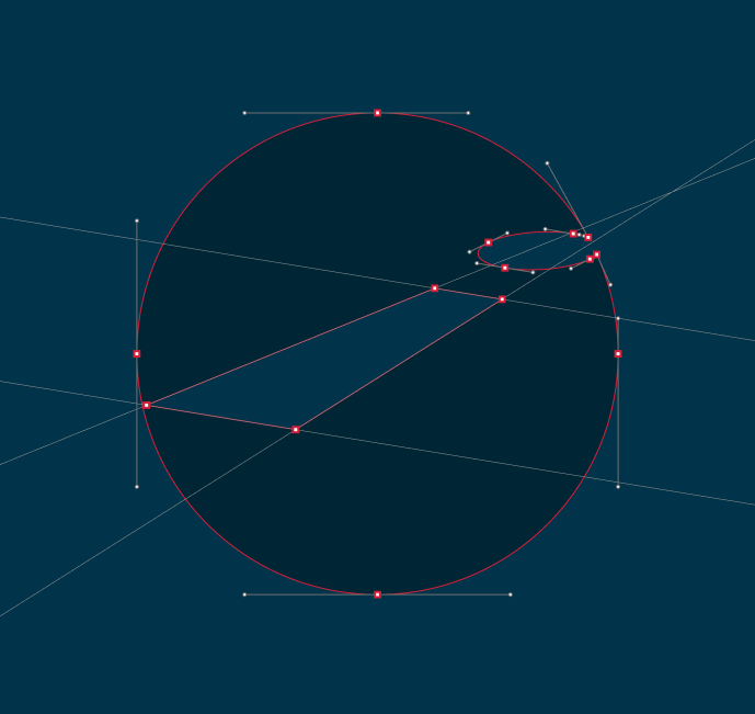
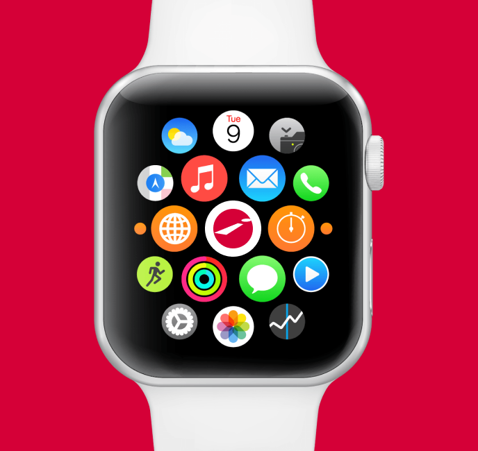
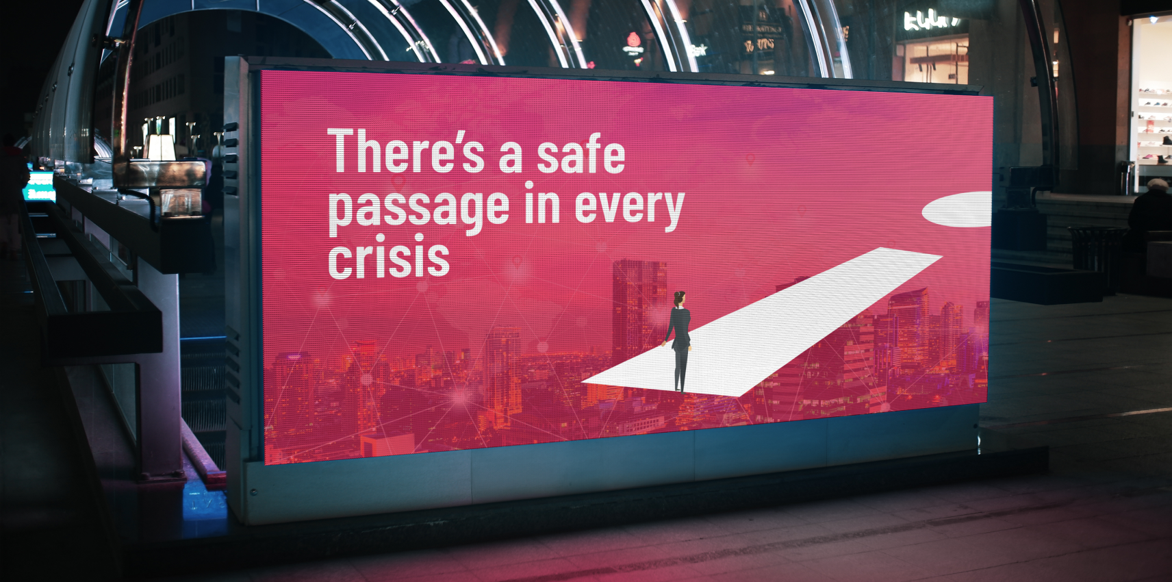
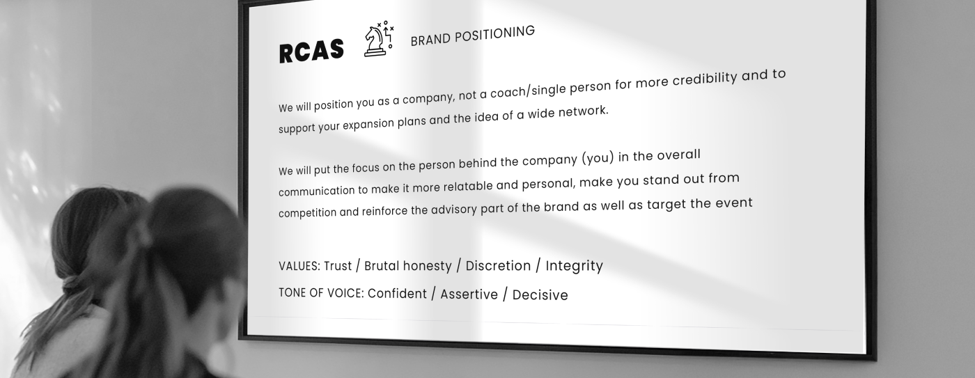
We crafted a focused brand strategy for RCAS, rooted in trust, discretion, and integrity. Backed by extensive market research, we developed clear positioning, messaging, and taglines that reinforced RCAS as a credible, network-based authority in crisis management. This approach ensured their identity resonated with their audience while aligning seamlessly with their business goals.
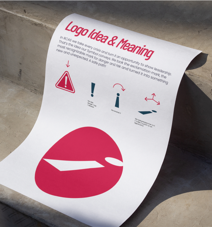
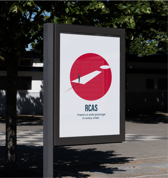
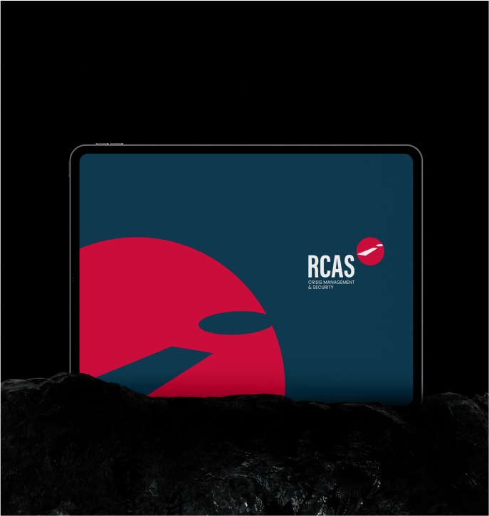
We presented several compelling logo options to RCAS so that they could find one they best believed serves their clients. The logo needed to be simple, clear, effective and drive action. Crisis Management and Security is a priority and needs to treated with urgency. The logo we created featuring a path forward with an exclamation mark speaks to that urgency.
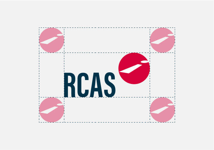
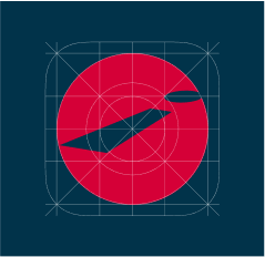
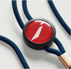
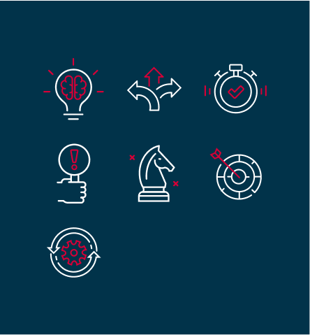
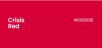
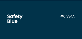
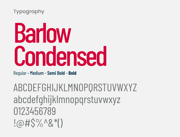
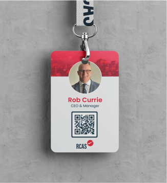
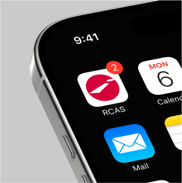
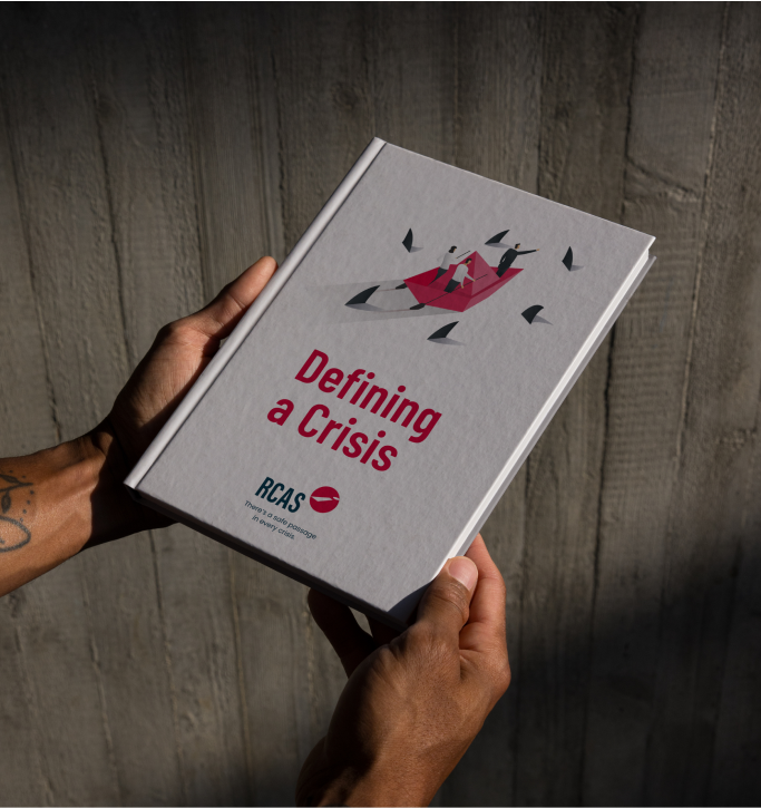
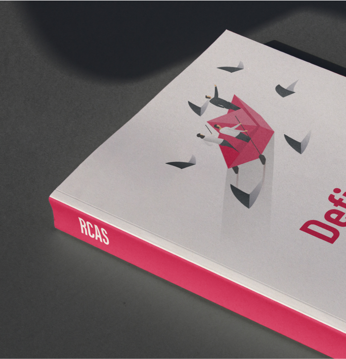
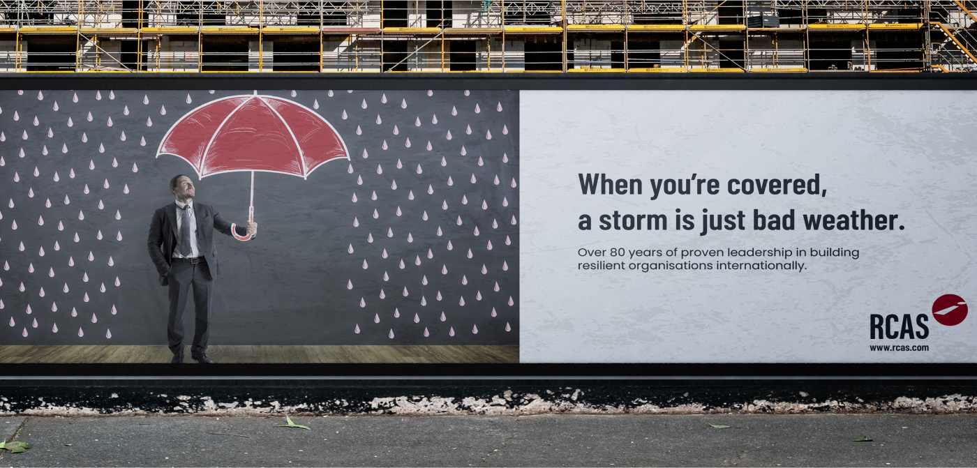
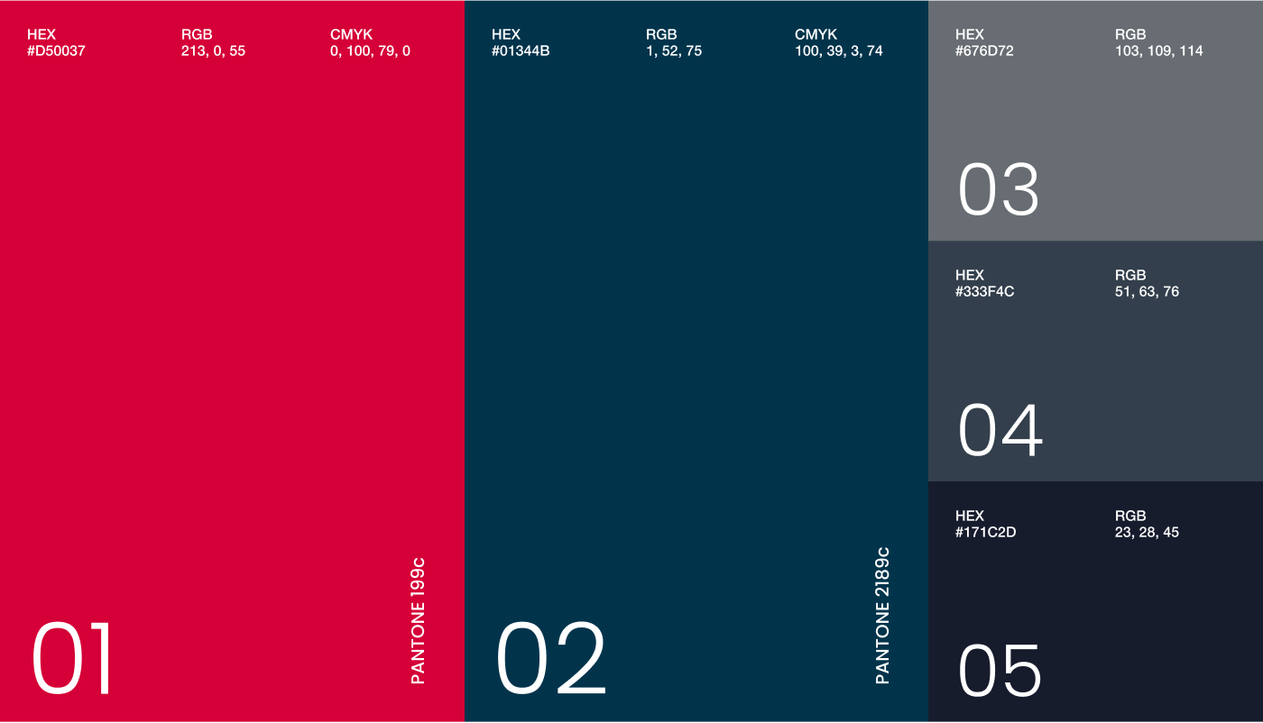
At the very core of the visual identity, we created a colour palette: red to represent danger and blue to represent security. Bold fonts and attention-grabbing animations drive home important messages and statistics. Supporting graphics and imagery that represent security and strategic development are found throughout the branding.
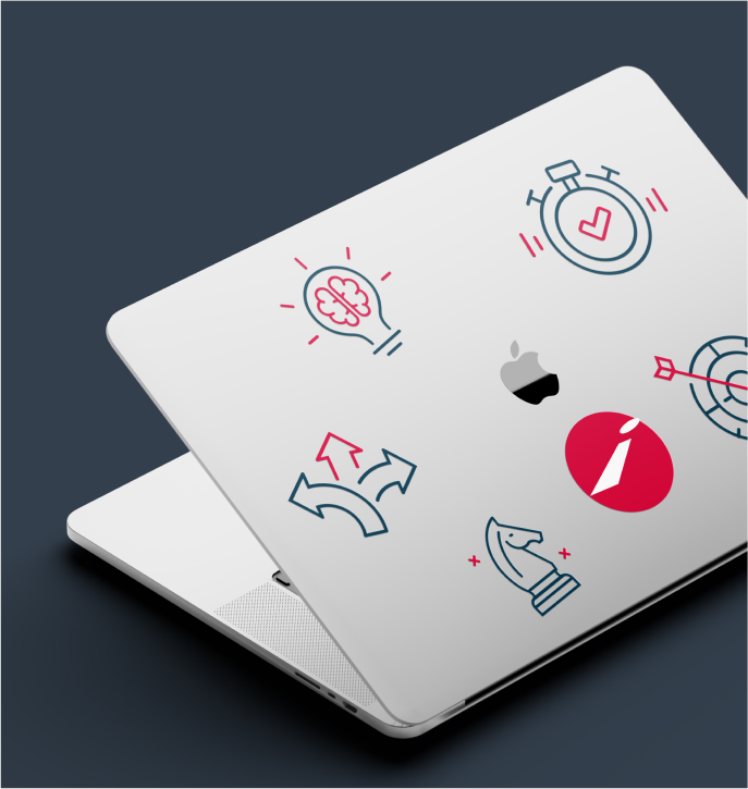
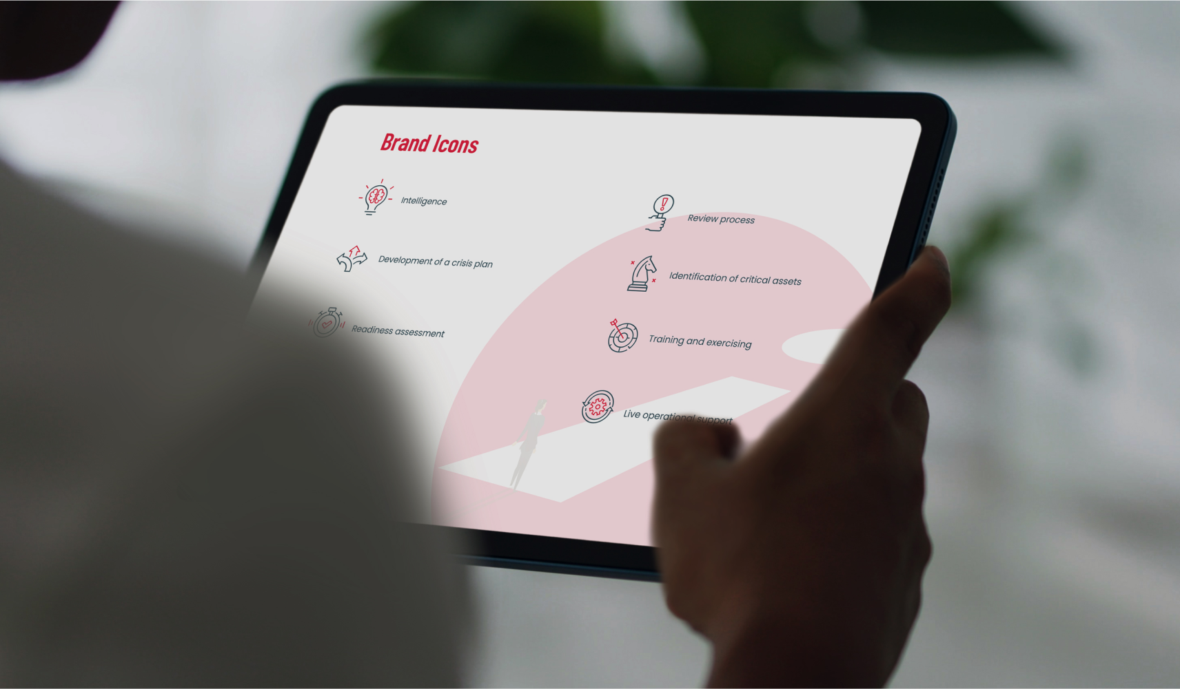
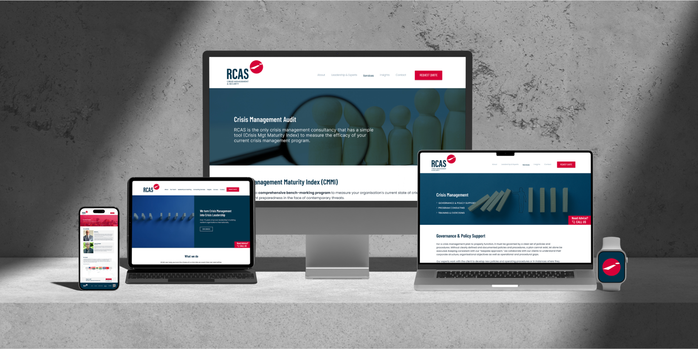
We created custom icons and implemented trippy mouse hover effects to elevate the overall experience. By incorporating collage-style black and white images of body parts associated with the human senses for the hover effects, we enhanced the website’s trippy look and feel, adding an extra layer of visual intrigue.
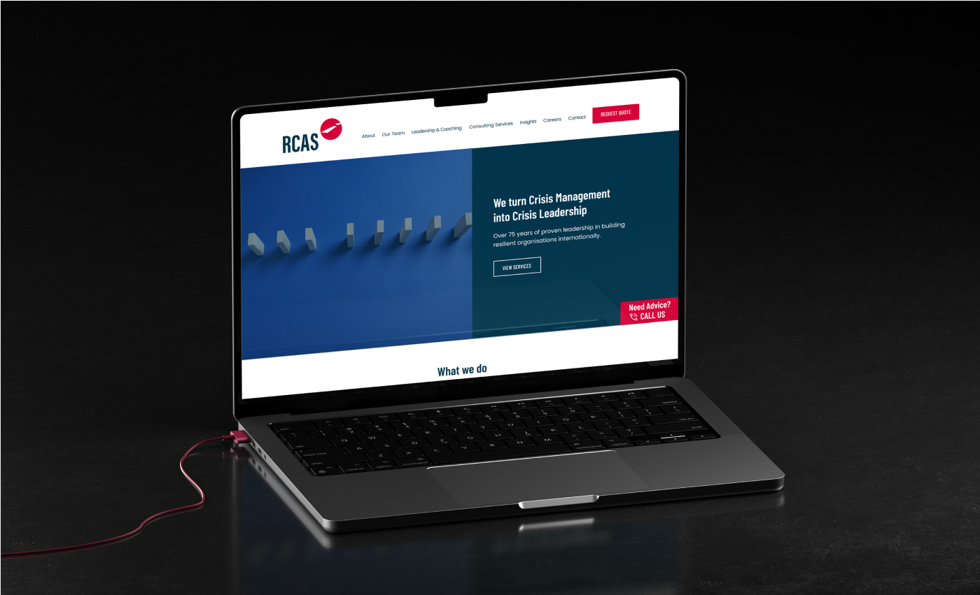
RCAS now has a client-focused website that is easy to navigate. The website drives action and generates client leads. Governmental bodies, Fortune 500 companies and multi-national organizations can now have confidence that they are working with the world’s best security and crisis management company.
The website was created so that it would be easy to manage. No advanced in-house tech personnel is necessary. We provided simple, easy-to-follow support to ensure that the website could be updated and managed easily.
Before After

We believe in value. Value that makes the difference in your results, without the uncomfortable conversation to upsell an extra item with a price tag. MK-Way regularly goes above and beyond because we genuinely care about the people we work with. Here are a few value-added items that we prepared for Believe as our way of showing our appreciation for their business.


